The page navigation is complete. You may now navigate the page content as you wish.
Skip to main content

Code Block

Updated in v6.2.1

A container for displaying formatted chunks of code with syntax highlighting and related features.

The Code Block is used to display, format, and highlight the syntax of code snippets.

Usage

When to use

  • When displaying code examples and longer snippets of code that benefit from syntax highlighting.

When not to use

  • As a full-blown code editor.
  • As an embedded terminal or terminal emulator.

When to use a Code Block vs. a Copy Snippet

There is some overlap in the copying functionality of the Copy Snippet and the Code Block. Which to use generally comes down to the complexity of the code/value displayed within the component, and whether the user benefits from seeing the larger context of the code example.

Use a Code Block:

  • If viewing or displaying code is the primary purpose, and copying the code is secondary.
  • If the example consists of a command, e.g., a curl and bash script. These are oftentimes on a single line, but consist of multiple commands and functions.

Use a Copy Snippet:

  • If copying the code is the primary purpose, and viewing the code is secondary.
  • If allowing the user to copy an API key or other single value or string.
  • If seeing the value in a larger context of where it's expected to be pasted into isn’t necessary.

Standalone

The isStandalone property increases the portability of the Code Block to ensure that it can be used in different contexts. For example, a common use case of the Code Block is in a "standalone" context, which can be part of a form, multi-step process, and is generally a part of the normal layout flow.
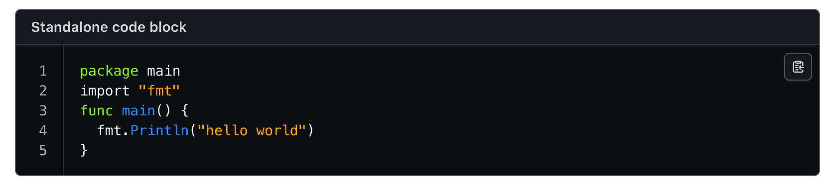
Code Block with rounded corners in a standalone context

Sometimes it may be necessary to use the Code Block in a more dense layout or nested within another component. In this circumstance, setting isStandalone to false ensures that the Code Block fits alongside other elements, in a split view, or as part of a larger layout mechanism.
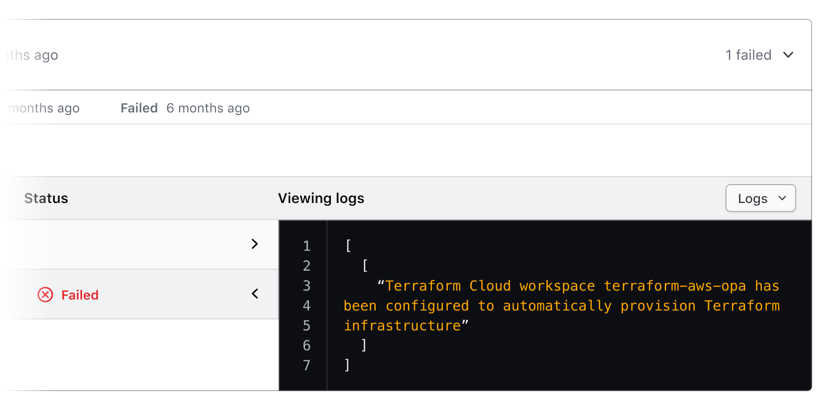
Code Block in a block context

Use a title and/or description in the header to provide additional information, instructions, or to label a Code Block. Both of these properties are optional, but including them can help to provide additional context about a specific block of code.
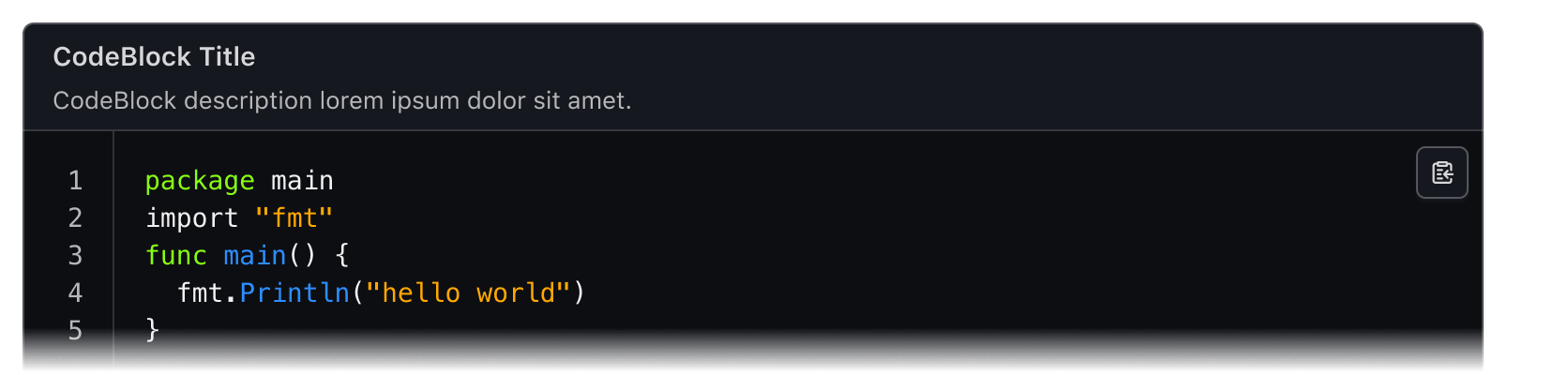
Example metadata in the Code Block

When not to use a header

There can be an overlap between content that you may choose to include in the header as a title or description, and content that is part of the normal layout flow in a headline or paragraph. If it is necessary to elevate this content in the hierarchy of the page, we recommend including it in the normal layout flow, rather than as a title or description within the Code Block.
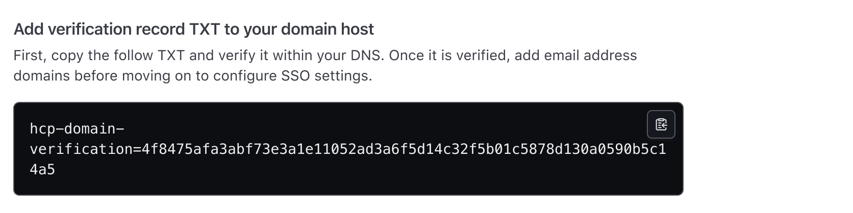
An example showcasing the Code Block paired with content in the natural flow

CopyButton

Use a CopyButton within the Code Block to make copying the snippet a single action. More details can be found in the CopyButton guidelines.

An example of the Copy Button within the Code Block

Line selection

If a user needs to copy only a portion of the Code Block, the relevant portion can be selected with a cursor and copied via the keyboard or mouse.

Selecting a single line in the Code Block

Line numbers

Figma tip

In the Figma component, the code examples have the appropriate number of lines by default but must be manually hidden or shown to match the length of custom snippets.

Height toggle button

For longer code content, it can be helpful to set a maxHeight for the Code Block to limit how much code is shown by default within the UI layout. If the content exceeds this height, a “Show more code” button will be displayed at the bottom of the Code Block, allowing users to expand it. Activating this button again will collapse the content back to its original height.

In Figma, this is enabled by setting hasToggleHeightButton to true. The button is placed inside a footer element that only appears when the content overflows, keeping the layout clean when the toggle isn’t needed.
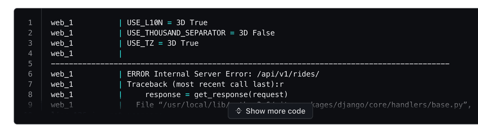
Collapsed Code Block showing limited lines and a 'Show more code' button at the bottom.

Interacting with this button removes the height limit, expanding the Code Block to display the full code snippet.
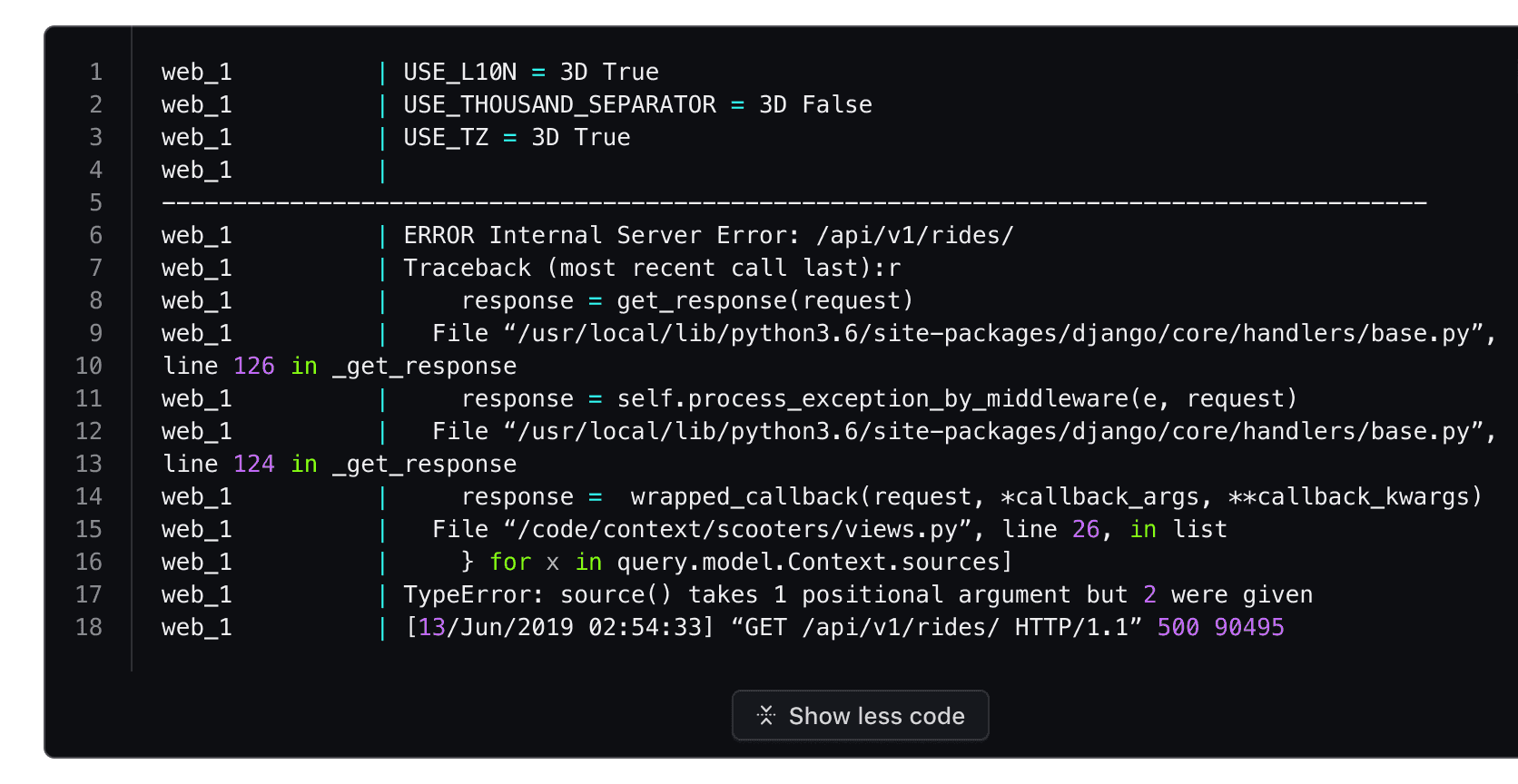
Expanded Code Block with all lines visible and a 'Show less code' button displayed at the bottom

Interacting with it again collapses the Code Block back to its set maxHeight.

Line highlighting

Differences between Figma and code

In the Ember component, lines can be highlighted by passing a single line number, multiple line numbers, or a range of lines. For more examples, refer to the How to use documentation.

In the Figma component, line highlighting (highlightLines) is a boolean property that displays a representative example of what a highlighted line will look like visually and is not a property that can be controlled by the consumer. Instead, lines that are intended to be highlighted should be communicated in the engineering handoff or annotated in the design file.

Use line highlighting to target and call attention to specific lines or multiple lines within a block of code.

Example of line highlighting in the Code Block

Language

Language determines how syntax highlighting is applied and formatted within the block but is handled a bit differently between the Ember and Figma components.

The Ember component uses Prism.js to handle syntax highlighting and comes with a pre-defined set of languages.

In Figma we provide a handful of example languages that are intended to be representative of the end result in production. Syntax highlighting in Figma is a non-trivial process and requires the manual application of color styles to each "type" of code. Despite this, creating a custom code snippet with the Code Block is supported by typing/pasting into the text layer, but syntax highlighting will not be automatically applied.

Applying syntax highlighting

If you wish to create custom examples using the Code Block, we publish all of the relevant syntax highlighting variables in the HDS Components v2.0 library. However, due to the number of languages supported by the component, the color styles use a generic naming schema (e.g., cyan, red, purple) to remain as agnostic as possible when being applied to different languages.

For more details around syntax visit the specifications.

How to use this component

To use this component, you must either include the yielded Title component, provide an @ariaLabel, or specify an @ariaLabelledBy.

The basic invocation requires a @value argument. The component encodes this argument before displaying it.

Code alert

If the \n escape sequence is used in the @value string in Handlebars, it will not be automatically converted to a newline, as it can have unexpected side effects.

<Hds::CodeBlock @ariaLabel="basic usage" @value="aws ec2 --region us-west-1 accept-vpc-peering-connection" />

Title and description

Optionally, you can pass a title and/or a description.

\n

\n CodeBlock title\n

\n \n\n \n

\n CodeBlock description\n

\n
<Hds::CodeBlock @language="bash" @value="aws ec2 --region us-west-1 accept-vpc-peering-connection" as |CB|>
  <CB.Title>
    CodeBlock title
  </CB.Title>
  <CB.Description>
    CodeBlock description
  </CB.Description>
</Hds::CodeBlock>

Title tag

The @tag argument changes the HTML element that wraps the [CB].Title content. When organizing the content on a webpage, the heading levels should reflect the structure of the page. For example, if a CodeBlock is within a subsection of the page below a heading level 2, the value should be "h3".

Accessibility alert

The default @tag is "div" because the correct value is dependent on the individual page. We strongly encourage consumers to update the @tag to the appropriate heading tag to meet WCAG Success Criterion 1.3.1 Info and Relationships as the visual experience should match what is presented to the user with assistive technology.

Error rendering the dynamic template

There was an error rendering the dynamic template for this page.
Check the console to see the details of the error.

If you need support or want to notify the Design Systems Team of this error, please contact us.

<div class="doc-code-block-demo-heading">
  <Hds::Text::Display @tag="h2" @size="300">
    Learn to write functions
  </Hds::Text::Display>
  <Hds::Text::Body @tag="p">
    Functions are a critical part of learning to code. They are reusable chunks of code that can perform tasks like
    convert an object to an array.
  </Hds::Text::Body>
</div>
<Hds::CodeBlock
  @language="go"
  @value="package main
import fmt
func main() {
  fmt.Println(helloWorld)
}"
  as |CB|
>
  <CB.Title @tag="h3">
    Example function
  </CB.Title>
</Hds::CodeBlock>

Language

The language argument sets the syntax highlighting used. We only support the following languages: bash, go, hcl, json, log, ruby, shell-session, and yaml. If you need additional languages contact the Design Systems Team

The page navigation is complete. You may now navigate the page content as you wish.
Skip to main content

Code Block

Updated in v6.2.1

A container for displaying formatted chunks of code with syntax highlighting and related features.

The Code Block is used to display, format, and highlight the syntax of code snippets.

Usage

When to use

  • When displaying code examples and longer snippets of code that benefit from syntax highlighting.

When not to use

  • As a full-blown code editor.
  • As an embedded terminal or terminal emulator.

When to use a Code Block vs. a Copy Snippet

There is some overlap in the copying functionality of the Copy Snippet and the Code Block. Which to use generally comes down to the complexity of the code/value displayed within the component, and whether the user benefits from seeing the larger context of the code example.

Use a Code Block:

  • If viewing or displaying code is the primary purpose, and copying the code is secondary.
  • If the example consists of a command, e.g., a curl and bash script. These are oftentimes on a single line, but consist of multiple commands and functions.

Use a Copy Snippet:

  • If copying the code is the primary purpose, and viewing the code is secondary.
  • If allowing the user to copy an API key or other single value or string.
  • If seeing the value in a larger context of where it's expected to be pasted into isn’t necessary.

Standalone

The isStandalone property increases the portability of the Code Block to ensure that it can be used in different contexts. For example, a common use case of the Code Block is in a "standalone" context, which can be part of a form, multi-step process, and is generally a part of the normal layout flow.

Code Block with rounded corners in a standalone context

Sometimes it may be necessary to use the Code Block in a more dense layout or nested within another component. In this circumstance, setting isStandalone to false ensures that the Code Block fits alongside other elements, in a split view, or as part of a larger layout mechanism.

Code Block in a block context

Use a title and/or description in the header to provide additional information, instructions, or to label a Code Block. Both of these properties are optional, but including them can help to provide additional context about a specific block of code.

Example metadata in the Code Block

When not to use a header

There can be an overlap between content that you may choose to include in the header as a title or description, and content that is part of the normal layout flow in a headline or paragraph. If it is necessary to elevate this content in the hierarchy of the page, we recommend including it in the normal layout flow, rather than as a title or description within the Code Block.

An example showcasing the Code Block paired with content in the natural flow

CopyButton

Use a CopyButton within the Code Block to make copying the snippet a single action. More details can be found in the CopyButton guidelines.

An example of the Copy Button within the Code Block

Line selection

If a user needs to copy only a portion of the Code Block, the relevant portion can be selected with a cursor and copied via the keyboard or mouse.

Selecting a single line in the Code Block

Line numbers

Figma tip

In the Figma component, the code examples have the appropriate number of lines by default but must be manually hidden or shown to match the length of custom snippets.

Height toggle button

For longer code content, it can be helpful to set a maxHeight for the Code Block to limit how much code is shown by default within the UI layout. If the content exceeds this height, a “Show more code” button will be displayed at the bottom of the Code Block, allowing users to expand it. Activating this button again will collapse the content back to its original height.

In Figma, this is enabled by setting hasToggleHeightButton to true. The button is placed inside a footer element that only appears when the content overflows, keeping the layout clean when the toggle isn’t needed.

Collapsed Code Block showing limited lines and a 'Show more code' button at the bottom.

Interacting with this button removes the height limit, expanding the Code Block to display the full code snippet.

Expanded Code Block with all lines visible and a 'Show less code' button displayed at the bottom

Interacting with it again collapses the Code Block back to its set maxHeight.

Line highlighting

Differences between Figma and code

In the Ember component, lines can be highlighted by passing a single line number, multiple line numbers, or a range of lines. For more examples, refer to the How to use documentation.

In the Figma component, line highlighting (highlightLines) is a boolean property that displays a representative example of what a highlighted line will look like visually and is not a property that can be controlled by the consumer. Instead, lines that are intended to be highlighted should be communicated in the engineering handoff or annotated in the design file.

Use line highlighting to target and call attention to specific lines or multiple lines within a block of code.

Example of line highlighting in the Code Block

Language

Language determines how syntax highlighting is applied and formatted within the block but is handled a bit differently between the Ember and Figma components.

The Ember component uses Prism.js to handle syntax highlighting and comes with a pre-defined set of languages.

In Figma we provide a handful of example languages that are intended to be representative of the end result in production. Syntax highlighting in Figma is a non-trivial process and requires the manual application of color styles to each "type" of code. Despite this, creating a custom code snippet with the Code Block is supported by typing/pasting into the text layer, but syntax highlighting will not be automatically applied.

Applying syntax highlighting

If you wish to create custom examples using the Code Block, we publish all of the relevant syntax highlighting variables in the HDS Components v2.0 library. However, due to the number of languages supported by the component, the color styles use a generic naming schema (e.g., cyan, red, purple) to remain as agnostic as possible when being applied to different languages.

For more details around syntax visit the specifications.

How to use this component

To use this component, you must either include the yielded Title component, provide an @ariaLabel, or specify an @ariaLabelledBy.

The basic invocation requires a @value argument. The component encodes this argument before displaying it.

Code alert

If the \n escape sequence is used in the @value string in Handlebars, it will not be automatically converted to a newline, as it can have unexpected side effects.

<Hds::CodeBlock @ariaLabel="basic usage" @value="aws ec2 --region us-west-1 accept-vpc-peering-connection" />

Title and description

Optionally, you can pass a title and/or a description.

\n

\n CodeBlock title\n

\n \n\n \n

\n CodeBlock description\n

\n
<Hds::CodeBlock @language="bash" @value="aws ec2 --region us-west-1 accept-vpc-peering-connection" as |CB|>
  <CB.Title>
    CodeBlock title
  </CB.Title>
  <CB.Description>
    CodeBlock description
  </CB.Description>
</Hds::CodeBlock>

Title tag

The @tag argument changes the HTML element that wraps the [CB].Title content. When organizing the content on a webpage, the heading levels should reflect the structure of the page. For example, if a CodeBlock is within a subsection of the page below a heading level 2, the value should be "h3".

Accessibility alert

The default @tag is "div" because the correct value is dependent on the individual page. We strongly encourage consumers to update the @tag to the appropriate heading tag to meet WCAG Success Criterion 1.3.1 Info and Relationships as the visual experience should match what is presented to the user with assistive technology.

Error rendering the dynamic template

There was an error rendering the dynamic template for this page.
Check the console to see the details of the error.

If you need support or want to notify the Design Systems Team of this error, please contact us.

<div class="doc-code-block-demo-heading">
  <Hds::Text::Display @tag="h2" @size="300">
    Learn to write functions
  </Hds::Text::Display>
  <Hds::Text::Body @tag="p">
    Functions are a critical part of learning to code. They are reusable chunks of code that can perform tasks like
    convert an object to an array.
  </Hds::Text::Body>
</div>
<Hds::CodeBlock
  @language="go"
  @value="package main
import fmt
func main() {
  fmt.Println(helloWorld)
}"
  as |CB|
>
  <CB.Title @tag="h3">
    Example function
  </CB.Title>
</Hds::CodeBlock>

Language

The language argument sets the syntax highlighting used. We only support the following languages: bash, go, hcl, json, log, ruby, shell-session, and yaml. If you need additional languages contact the Design Systems Team