Use Pagination to let users navigate through content broken down into pages. Usually paired with tables, but works with other types of page content.
Usage
When to use
- To break down large content into pages. Usually paired with tables, but works with other types of page content.
When not to use
- As a navigation control for a flow or to pair with a stepper, i.e. for a guide, tutorial, or setup flow.
- As a controller to switch between multiple views. Use Tabs instead.
Numbered vs Compact
Cursor and offset are the most common types of pagination. Currently, most HashiCorp products use cursor-based pagination.
Cursor-based pagination allows users to navigate to the next or previous set of records no matter where the user is located within the dataset (record 1 or 300). This type of pagination uses the latest record that has been delivered to the client from a database to determine the relative location within the data set, rather than the exact page number.
Offset or page-based pagination divides a dataset into pages containing a default or user-determined number of records, and allows users navigate to any particular page. In most cases, the numbered pagination provides a better user experience. It allows users to jump between pages and always return to the first page or go to the last page without navigating through the pages manually.


Truncation
By default, in Numbered Pagination, the number of visible pages will be truncated when the total number of pages exceeds seven. What pages are truncated depends on the current page the user is on, with a few notable constants:
- The first and last page will always be displayed (never be truncated).
- The previous page and next page compared to the current page will always be displayed (unless the current page is the first or last page).
- A maximum of seven pages or truncated pages will always be displayed.
The number of pages equals total items / items per page, e.g., if the total number of items is 120 and there are 10 items per page, the number of pages is 12. However, this can be variable depending on the PageSize and can determine whether the number of pages extends beyond the threshold of truncation.
Current page examples
These examples showcase where truncation will occur depending on what page the user is on; at the start, middle, or end of Pagination.



When to use truncation
Truncation can help to reduce the cognitive load on the user by only displaying immediately relevant pages to navigate between; those directly surrounding the current page, and the first/last page.
While not intended to be used as a solution for a responsive layout, truncation can help to save space if there are many pages.
When not to use truncation
Truncation can have a negative impact on the user experience if navigating to a specific page is required, or if seeing all of the pages at once benefits the user.
Spacing
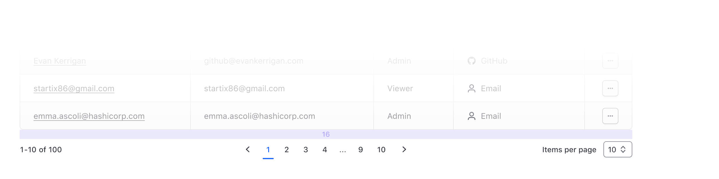
- When using the pagination bar, the container should be flush on the left & right with the content.
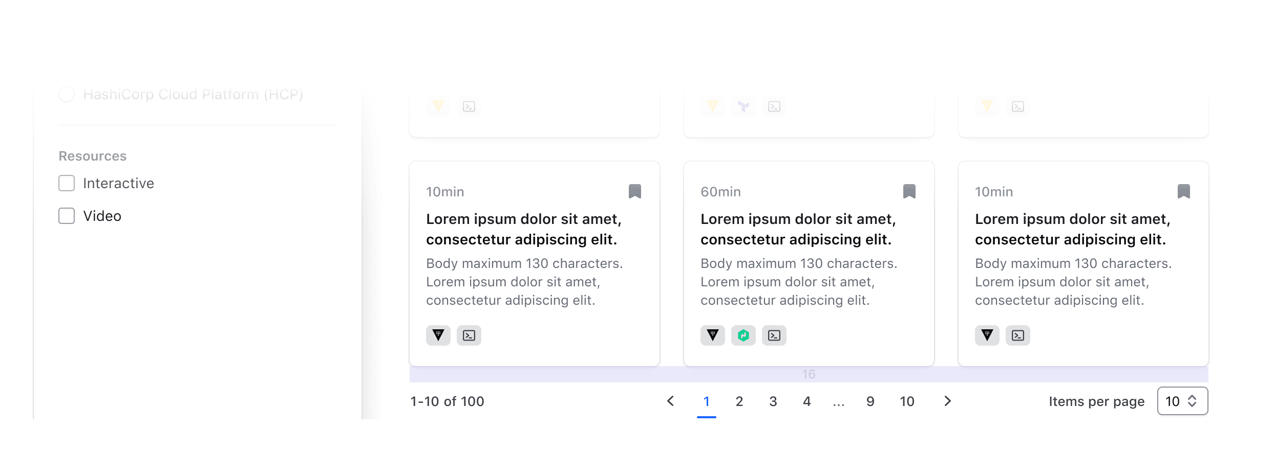
- When using the pagination, the component should be center aligned with the content it relates to.
- Make sure there’s enough distance and breathing room between the pagination and unrelated content (e.g. another section below it), so it’s clear what content the pagination is paired with.
When pairing the pagination or pagination bar with your content, we recommend leaving 16px of margin between the pagination and the content it relates to.
If your product uses a significantly higher or lower spacing scale, increase or decrease the spacing accordingly.
Pagination and filtering
While pagination can be beneficial for dividing up and displaying a large dataset into more manageable chunks, relying solely on pagination and sorting to find a specific record or set of records results in a poor user experience. This is especially true in cursor-based pagination, where it may not be clear to the user where their relative position is within the dataset.
Reflect filtered numbers
When filtering, the data set will limit the number of returned results and should be reflected in the pagination's total number count.
Compact vs Numbered Pagination
There are two different variants of the Pagination component (with different ways to invoke them) built to cover different use cases, contexts, and designs you may need them for.
This differentiation is necessary to cover both use cases of pagination for a list with a known number of elements (i.e., "numbered") and one in which this information is not available or is cursor-based (i.e., "compact").
In the first one, the user is presented with a list of navigation controls ("prev/next" and "page numbers" to go directly to a specific page) and other optional UI elements; in the second, much simpler one, the user is presented with only the "prev/next" controls (by default).
When pagination is invoked directly using one of these two components, it will automatically:
- provide the correct responsive layout for the entire Pagination and its sub-parts.
- manage the "current page" status across the different sub-components it’s made of (based on the arguments provided to it and its children).
- when one of the "navigation controls" is clicked, a callback function (if provided) is called, and a route (if provided) update is triggered.
- when the "page size" is changed via the provided selector, in the "numbered" variant it will automatically recalculate the total number of pages to display to the user.
Pagination sub-components
If you need more control on the specific Pagination parts, and/or you need to cover a very specific use case, you can use the Pagination sub-elements directly (Pagination::Info/Nav(*)/SizeSelector).
In this case, you will have to take care of different things yourself
- the organization/layout of the elements on the page.
- the logic to handle the "current page" status.
- the logic connecting the different parts (if using Numbered Pagination).
Events handling and routing
As described above, the main Pagination::Numbered and Pagination::Compact components expose an onPageChange callback function, invoked whenever a page change occurs. All the "navigation controls" in this cases are <button> elements that fire an onClick event that calls the onPageChange function.
This means that if you need to update the URL when the user changes the "page" in the Pagination (eg. to add/remove/update some query parameters), you have to do it within the onPageChange callback you provide to the component.
If instead you need to update the URL directly when the user clicks on one of the "navigation control" elements, you have to provide routing parameters (route/query/model/etc) to the component; refer to the "Component API" section below for specifications about these parameters (the APIs are slightly different for the two components).
How to use Numbered Pagination
The basic invocation of Numbered Pagination requires the @totalItems argument to be provided (plus the event/routing handlers, see below):
<Hds::Pagination::Numbered @totalItems={{40}} />By default the Info and SizeSelector sub-components are displayed, and the component takes care of updating the values and the states of the different elements, according to the user interactions with the component.
Extra arguments
It’s possible to customize the Info, Controls, and SizeSelector components by providing additional arguments to them. For more details about these parameters, refer to the "Component API" section.
Below is an example of some of these extra arguments:
<Hds::Pagination::Numbered
  @totalItems={{40}}
  @showTotalItems={{false}}
  @showSizeSelector={{false}}
  @pageSizes={{array 5 20 60}}
  @currentPageSize={{20}}
/>
Example of custom label text for Pagination::SizeSelector
<Hds::Pagination::Numbered @totalItems={{40}} @sizeSelectorLabel="Per page" />Truncation
When there is a large number of items and consequently the number of pages is also large, by default the component automatically "truncates" the number of visible pages (using "ellipses"):
<Hds::Pagination::Numbered @totalItems={{120}} />If necessary, it’s possible to disable this functionality using the @isTruncated argument:
<Hds::Pagination::Numbered @totalItems={{120}} @isTruncated={{false}} />Events handling
The component exposes two callback functions that can be used to respond to specific events:
<Hds::Pagination::Numbered
  @totalItems={{40}}
  @onPageChange={{this.handlePageChange}}
  @onPageSizeChange={{this.handlePageSizeChange}}
/>
The first onPageChange function is invoked when a user interacts with a navigation control ("prev/next" or "page number") and so can be used to respond to a "page" change (eg. updating the list of items in the page and/or updating the routing/URL).
The second onPageSizeChange function is invoked when a user interacts with the "size selector" and so can be used to respond to a "page size" change (eg. updating the number of items listed in the page, updating the routing/URL, and/or updating other elements in the page).
Routing/URL updates
If you want the Pagination to change the URL of the page directly (eg. updating the query parameters) you need to pass the routing parameters to the component:
<Hds::Pagination::Numbered
  @totalItems={{this.demoTotalItems}}
  @currentPage={{this.demoCurrentPage}}
  @pageSizes={{this.demoPageSizes}}
  @currentPageSize={{this.demoCurrentPageSize}}
  @route={{this.demoRouteName}}
  @queryFunction={{this.demoQueryFunctionNumbered}}
  @onPageChange={{this.handlePageChange}}
  @onPageSizeChange={{this.handlePageSizeChangeNumbered}}
/>
When the routing parameters are provided, the "navigation controls" are rendered as links and if the user clicks on one of them the page URL is automatically updated. This means that the component’s state is persisted outside of the component and so its whole state must be "controlled" by the consumer’s code (otherwise there would be conflicting states).
In this case, the component doesn’t update its internal "state" but the value of the state variables (eg. currentPage/currentPageSize) is always determined by the consumer’s controller code via the component’s arguments (usually, they are directly connected to the query parameters in the URL).
The reason for using a consumer-side function to determine the query argument is because it’s dynamic (it depends on the value of the page variable) and gives consumers the ability to specify their own query parameters (which will likely differ case by case).
Even if the Pagination is based on routing, the onPageChange/onPageSizeChange callbacks are still available and can be used to respond to the users’ actions (eg. for logging, tracking, etc.).
Below you can find an example of an integration between the sortable Table component and the Pagination::Numbered component that uses query parameters in the URL to preserve the UI state:
<div class="doc-pagination-table-demo">
  <Hds::Table
    @model={{this.demoPaginatedDataNumbered}}
    @columns={{array
      (hash key="id" label="ID" isSortable=true)
      (hash key="name" label="Name" isSortable=true)
      (hash key="email" label="Email")
      (hash key="role" label="Role")
    }}
    @density={{if (eq this.demoCurrentPageSize 30) "short" "medium"}}
  >
    <:body as |B|>
      <B.Tr>
        <B.Td>{{B.data.id}}</B.Td>
        <B.Td>{{B.data.name}}</B.Td>
        <B.Td>{{B.data.email}}</B.Td>
        <B.Td>{{B.data.role}}</B.Td>
      </B.Tr>
    </:body>
  </Hds::Table>
  <Hds::Pagination::Numbered
    @totalItems={{this.demoTotalItems}}
    @currentPage={{this.demoCurrentPage}}
    @pageSizes={{this.demoPageSizes}}
    @currentPageSize={{this.demoCurrentPageSize}}
    @route={{this.demoRouteName}}
    @queryFunction={{this.demoQueryFunctionNumbered}}
    @onPageChange={{this.handlePageChange}}
    @onPageSizeChange={{this.handlePageSizeChangeNumbered}}
  />
</div>
How to use Compact Pagination
By default, the basic use of the Pagination provides:
The basic invocation of the Compact Pagination doesn’t require any arguments (apart from the event/routing handlers, see below):
<Hds::Pagination::Compact />In this variant, only the "prev" and "next" navigation controls are displayed.
Extra arguments
If necessary, it’s possible to hide the control labels:
<Hds::Pagination::Compact @showLabels={{false}} />It is also possible to show the SizeSelector (hidden by default):
<Hds::Pagination::Compact @showSizeSelector={{true}} />Event handling
The component exposes a callback function that can be used to respond to page changes:
<Hds::Pagination::Compact @onPageChange={{this.handlePageChange}} />The onPageChange function is invoked when a user interacts with a "prev" or "next" navigation control and so can be used to respond to a "page" change (eg. updating the list of items in the page and/or updating the routing/URL).
Routing/URL updates
If you want the Pagination to change the URL of the page directly (eg. updating the query parameters) you need to pass the routing parameters to the component:
<Hds::Pagination::Compact
  @route={{this.demoRouteName}}
  @queryFunction={{this.demoQueryFunctionCompact}}
  @isDisabledPrev={{this.demoIsDisabledPrev}}
  @isDisabledNext={{this.demoIsDisabledNext}}
/>
When the routing parameters are provided, the "prev/next" controls are rendered as links and the page URL is automatically updated when the user clicks them. This means that the component’s state is persisted outside of the component and so its whole state must be "controlled" by the consumer’s code (otherwise there would be conflicting states).
In this case, the component doesn’t update its internal "state" but the value of the state variables is always determined by the consumer’s controller code via the component’s arguments (usually, they are directly connected to the query parameters in the URL).
The reason for using a consumer-side function to determine the query argument is because it’s dynamic (it depends on the value of the page/cursor variable) and gives consumers the ability to specify their own query parameters (which will likely differ case by case).
Even if the Pagination is based on routing, the onPageChange/onPageSizeChange callbacks are still available and can be used to respond to the users' actions (eg. for logging, tracking, etc.).
Below you can find an example of an integration between the Table component and the Pagination::Compact component that uses query parameters in the URL to preserve the UI state:
<div class="doc-pagination-table-demo">
  <Hds::Table
    @model={{this.demoPaginatedDataCompact}}
    @columns={{array
      (hash key="id" label="ID")
      (hash key="name" label="Name")
      (hash key="email" label="Email")
      (hash key="role" label="Role")
    }}
  >
    <:body as |B|>
      <B.Tr>
        <B.Td>{{B.data.id}}</B.Td>
        <B.Td>{{B.data.name}}</B.Td>
        <B.Td>{{B.data.email}}</B.Td>
        <B.Td>{{B.data.role}}</B.Td>
      </B.Tr>
    </:body>
  </Hds::Table>
  <Hds::Pagination::Compact
    @route={{this.demoRouteName}}
    @queryFunction={{this.demoQueryFunctionCompact}}
    @isDisabledPrev={{this.demoIsDisabledPrev}}
    @isDisabledNext={{this.demoIsDisabledNext}}
  />
</div>
Component API
The term “Pagination component” is an umbrella term used to indicate a set of Pagination-related components and sub-components, each with their own APIs.
There are two main high-level “container” components, which control the layout and some of the logic that connects the different sub-components:
Pagination::Numbered- used when the number of items is known (this component handles all the complexity of the pagination information shown to the user: "info", "page numbers", "current page", "page size")Pagination::Compact- used when the number of items is unknown or the pagination needs to be cursor-based (so there is no concept of "current page")
For more details on when and how to use these two components, refer to the "How to use" section below.
There is also a set of low-level sub-components, used to build the Numbered and Compact variants:
Pagination::Info- used to display the current range of items shown and the total number of itemsPagination::Nav::Arrow- used to provide "prev/next" navigation controlsPagination::Nav::Number- used to provide "page number" navigation controlsPagination::Nav::Ellipsis- used to display an ellipsis instead of a set of page numbersPagination::SizeSelector- used to allow users to change the number of items displayed per page
These Pagination sub-elements may be used directly if you need to cover a very specific use case that is not covered by the Numbered or Compact Pagination components. In that case, refer to their specific APIs below.
Pagination::Numbered
ariaLabel
string
- Pagination (default)
totalItems
number
showLabels
boolean
- false (default)
isTruncated
boolean
- true (default)
currentPage
integer
- 1 (default)
- integer
showSizeSelector
boolean
- true (default)
sizeSelectorLabel
string
- Items per page (default)
pageSizes
array
- [10, 30, 50] (default)
- array of integers
@pageSizes={{array 5 20 30}}.
currentPageSize
number
pageSizes will be used. Default is 10 if custom pageSizes are not defined.
route/model/models/replace
Hds::Pagination::Arrow/Hds::Pagination::Number child components, and from them to the Hds::Interactive component (used internally). For more details about how this low-level component works please refer to its documentation page.
queryFunction
function
query argument for the routing, and that is passed down to the to the child components together with the other routing parameters. The function receives the value of the "go to" page and "page size" as arguments (integer numbers).
onPageChange
function
onPageSizeChange
function
…attributes
...attributes.
Pagination::Compact
ariaLabel
string
- Pagination (default)
showLabels
boolean
- true (default)
isDisabledPrev/isDisabledNext
boolean
- false (default)
<button> element.
showSizeSelector
boolean
- false (default)
sizeSelectorLabel
string
- Items per page (default)
pageSizes
array
- [10, 30, 50] (default)
- array of integers
@pageSizes={{array 5 20 30}}.
currentPageSize
number
pageSizes will be used. Default is 10 if custom pageSizes are not defined.
route/model/models/replace
Hds::Pagination::Arrow child components, and from them to the Hds::Interactive component (used internally). For more details about how this low-level component works, please refer to its documentation page.
queryFunction
function
query argument for the routing, and that is passed down to the to the child components together with the other routing parameters. The function receives as arguments one of two possible cursor directions (prev / next) and the value of the "page size" (integer number).
Notice: on page size change, the function returns
null as cursor direction, to allow the consumers to handle the pagination logic accordingly.
onPageChange
function
prev / next
onPageSizeChange
function
…attributes
...attributes.
Base elements
Pagination::Info
itemsRangeStart
string|number
itemsRangeEnd
string|number
totalItems
string|number
showTotalItems is set to false.
showTotalItems
boolean
- true (default)
Pagination::Nav::Arrow
direction
enum
- prev
- next
route/models/model/query/replace
Hds::Interactive component (used internally). For more details about how this low-level component works, please refer to its documentation page.
disabled
boolean
- false (default)
Button element.
showLabel
boolean
- true (default)
onClick
function
…attributes
...attributes.
Pagination::Nav::Number
page
number
isSelected
boolean
- false (default)
route/models/model/query/replace
Hds::Interactive component (used internally). For more details about how this low-level component works, please refer to its documentation page.
onClick
function
…attributes
...attributes. Notice: it will not be applied to the <li> wrapping element but to the nested <button>/<a> controls.
Pagination::Nav::Ellipsis
…attributes
...attributes. Notice: it will not be applied to the <li> wrapping element but to the nested <button>/<a> controls.
Pagination::SizeSelector
pageSizes
array of integers
@pageSizes={{array 5 20 30}}
selectedSize
integer
sizes options is pre-selected. Normally this value is passed automatically by the Pagination wrapper component but can be provided as argument to the Pagination::SizeSelector component itself when used as a stand alone component.
label
string
- Items per page (default)
onChange
function
…attributes
...attributes. Notice: it will not be applied to the <li> wrapping element but to the nested <button>/<a> controls.
Anatomy
Pagination

| Element | Usage |
|---|---|
| Info | Optional |
| Nav | Required |
| Size selector | Optional |
Pagination Nav

| Element | Usage |
|---|---|
| Prev page | Required |
| Next page | Required |
| Page number | Required for Compact, otherwise optional |
| Current page | Required |
Pagination Info
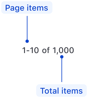
| Element | Usage |
|---|---|
| Page items | Required |
| Total items | Optional |
Size Selector
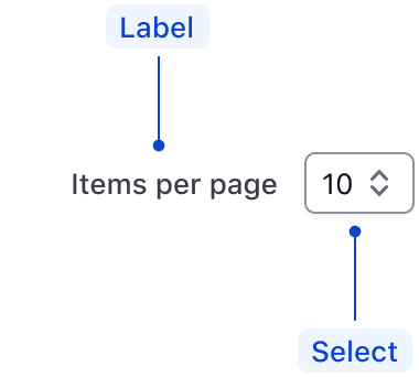
| Element | Usage |
|---|---|
| Label | Required |
| Select | Required |
States
Default

Selected

Conformance rating
When used as recommended, there should not be any WCAG conformance issues with this component.
Best practices
Keyboard navigation
In most cases, the numbered pagination provides a greater user experience. It allows users to jump between pages and always return to the first page or go to the last page without navigating through the pages manually.
If your product only has cursor pagination, it won’t be able to support the numbered variant. Only applications with offset pagination can implement the numbered pagination variant.
Focus and move between pagination controls.
tab

Trigger button to navigate to another page.
enter

Applicable WCAG Success Criteria
This section is for reference only. This component intends to conform to the following WCAG success criteria:
-
1.3.1
Info and Relationships (Level A):
Information, structure, and relationships conveyed through presentation can be programmatically determined or are available in text. -
1.3.2
Meaningful Sequence (Level A):
When the sequence in which content is presented affects its meaning, a correct reading sequence can be programmatically determined. -
1.4.1
Use of Color (Level A):
Color is not used as the only visual means of conveying information, indicating an action, prompting a response, or distinguishing a visual element. -
1.4.10
Reflow (Level AA):
Content can be presented without loss of information or functionality, and without requiring scrolling in two dimensions. -
1.4.11
Non-text Contrast (Level AA):
The visual presentation of the following have a contrast ratio of at least 3:1 against adjacent color(s): user interface components; graphical objects. -
1.4.12
Text Spacing (Level AA):
No loss of content or functionality occurs by setting all of the following and by changing no other style property: line height set to 1.5; spacing following paragraphs set to at least 2x the font size; letter-spacing set at least 0.12x of the font size, word spacing set to at least 0.16 times the font size. -
1.4.3
Minimum Contrast (Level AA):
The visual presentation of text and images of text has a contrast ratio of at least 4.5:1 -
2.1.1
Keyboard (Level A):
All functionality of the content is operable through a keyboard interface. -
2.1.2
No Keyboard Trap (Level A):
If keyboard focus can be moved to a component of the page using a keyboard interface, then focus can be moved away from that component using only a keyboard interface. -
2.2.1
Timing Adjustable (Level A):
If there are time limitations set by the content, one of the following should be true: turn off, adjust, extend, real-time exception, essential exception, 20 hour exception. -
2.5.3
Label in Name (Level A):
For user interface components with labels that include text or images of text, the name contains the text that is presented visually. -
4.1.2
Name, Role, Value (Level A):
For all user interface components, the name and role can be programmatically determined; states, properties, and values that can be set by the user can be programmatically set; and notification of changes to these items is available to user agents, including assistive technologies. -
4.1.3
Status Messages (Level AA):
In content implemented using markup languages, status messages can be programmatically determined through role or properties such that they can be presented to the user by assistive technologies without receiving focus.
Support
If any accessibility issues have been found within this component, let us know by submitting an issue.
6.1.1
Translated strings for PaginationCompact and PaginationNumbered ariaLabels. Translated strings for PaginationNavArrow ariaLabels and button text.
6.1.0
Converted component to gts format.
6.0.0
Updated HdsIntlService service declaration for PaginationInfo to align how services are declared
4.22.0
Translated template strings
4.20.0
Replaced custom breakpoint (1000px) with standard lg (1088px) breakpoint
4.15.0
Aligned private class properties to follow a standardized notation
4.10.0
Converted component to Typescript
Related
-

Table
Used to display organized, two-dimensional tabular data.
-

Advanced Table
Used to display complex, structured tabular data with advanced features.
-

Filter patterns
Guidelines and best practices for filtering a data set using Helios components.
-

Table multi-select
Guidelines for selecting and transforming results in a Table.