The App Header provides consistent controls for navigating between global areas of the application (organizations and projects) and accessing application utilities like support, documentation, and user settings. It should be paired with the App Side Nav component within the App Frame (in code).
Usage
When to use
- Provide consistent global navigation across an application.
- Offer quick access to important utilities such as user settings, help, and search.
- Establish a clear visual hierarchy and brand presence at the top of the application.
When not to use
- To navigate within subpages of an organization or project, use the App Side Nav instead.
Navigation hierarchy
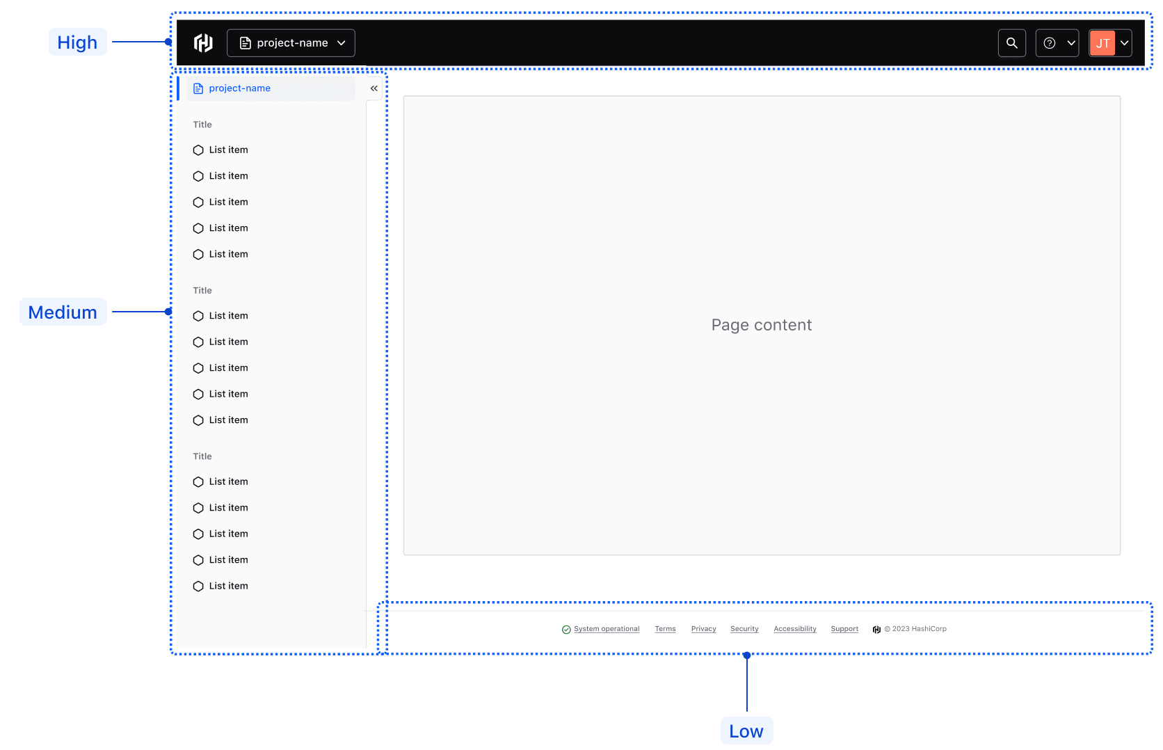
The App Header provides consistent navigation between global application areas, such as organizations and projects, while facilitating easy access to utilities like support and user settings.
In the hierarchy of navigational elements, the App Header sits at the top and is followed by:
- The App Side Nav, which focuses on contextual pages and subpages within a project or organization.
- The App Footer, which focuses on non-essential metadata and general links.
Global navigation
Home link
The home link gives users quick, consistent access to the application's home page or dashboard.
For cloud products, the icon should always be hcp. For standalone or open-source products, it should be the product’s service icon; e.g., terraform.

Text
The home link supports an optional text property to more explicitly title an application. We recommend using this property sparingly as it's often unnecessary to title a HashiCorp application in such an explicit manner.

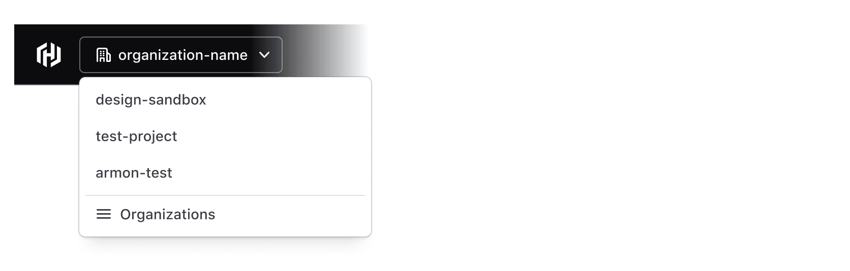
Context switcher
The context switcher allows users to switch between different global contexts within the product or application, such as navigating between different organizations or projects.
Utility navigation
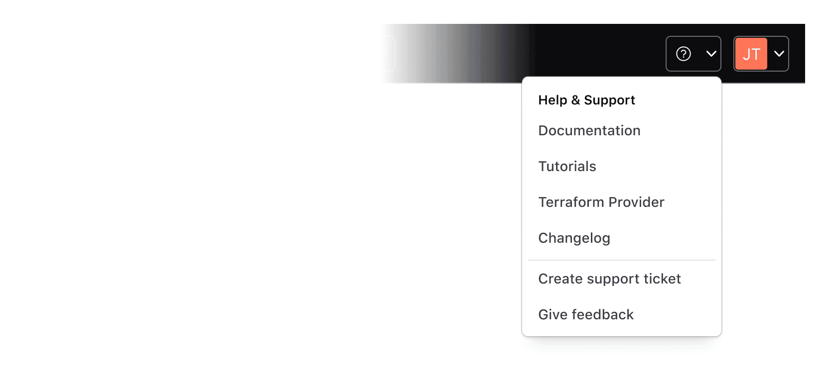
Help dropdown
Use the help dropdown to provide users with access to support and helpful resources that can be easily accessible from anywhere within the application, e.g., links to the help center, documentation, or tutorials.
Avoid placing non-help-related links within the help dropdown menu.
User dropdown
The user dropdown gives users quick and easy access to their settings and preferences. The menu should contain links or actions related to the user's profile, settings, and/or preferences.
Avoid placing links to unrelated pages within the user dropdown menu.

Search
Search within the App Header is triggered by a standard HDS Button themed to match the App Header’s styles. The application teams are responsible for building search capabilities themselves, if and when needed.

Sizes
The Hds::AppHeader component supports basic responsive behavior out of the box with a single breakpoint at 1088px. The Figma component offers two variants:
Large: applicable for most desktop-sized viewports with a minimum width of 1088px.Small: applicable for most mobile and some tablet-sized viewports with a maximum width of 1088px.


Menu
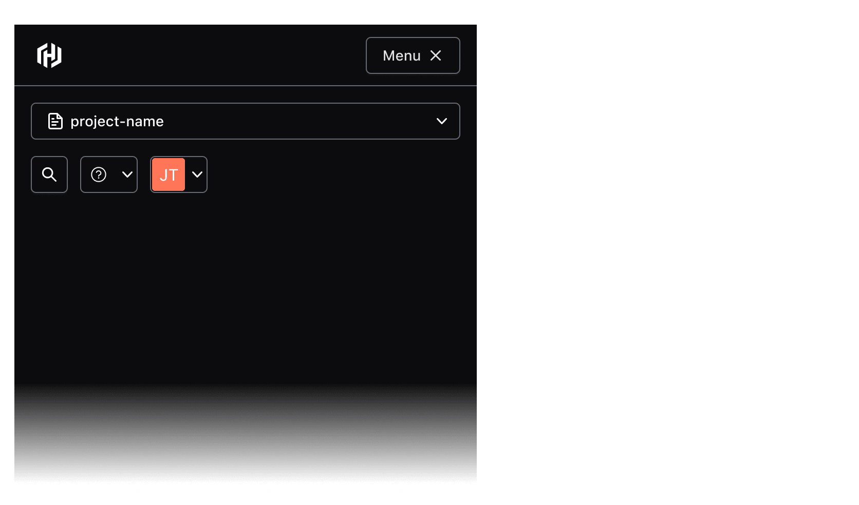
In the Ember component, the controls (context switcher, help/user dropdown, etc) contained within the App Header will collapse automatically into a vertical menu that can be toggled open and closed with the Menu button.
In Figma, we publish a separate Menu component for UIs and prototypes for smaller viewports.
Responsive characteristics
By default (and if used within the App Frame), the App Header will occupy 100% of the viewport width. As the viewport width condenses, the components' controls will collapse into a menu that can be toggled open/closed with the menu button (shown conditionally based on the viewport width).
At smaller viewports, the menu containing the AppHeader controls will occupy 100% of the viewport height and prevent scrolling content on the main page.
Usage in the App Frame
The AppHeader is intended to be used within the AppFrame component (only supported in code), where a location is reserved for the component out of the box.
If you intend to use the AppHeader without the AppFrame, contact the HDS team for assistance and guidance on implementation.
How to use this component
The AppHeader provides persistent global navigation controls and utility links such as help and user menus. It is meant to be paired with the AppSideNav which should be used to provide local or page-level navigation. Both these components are intended to be used within the Hds::AppFrame component. The AppHeader specifically should be used within the App Frame’s Frame.Header contextual component.
Layout
The AppHeader exposes three “slots” (named blocks) where consumers can yield the navigation content and also add business logic to control the content.
The <:logo> block should contain the AppHeader::HomeLink which is provided as a child component.
The other two slots are intended for consumer-provided controls. The <:globalActions> block should typically contain a “context switcher” (sometimes called an “org switcher” or “project switcher”). The <:utilityActions> block is used to provide utilities including “Help” and “User” menus and, optionally, “Search”.
{{! for demo purposes, we set @hasA11yRefocus to false but in your app it will
probably need to be set to true (or omitted to rely on defaults) }}
<Hds::AppHeader @hasA11yRefocus={{false}}>
  <:logo>
    <Doc::Placeholder @height="2em" @width="auto" @text="HomeLink" @background="#e4e4e4" />
  </:logo>

  <:globalActions>
    <Doc::Placeholder @height="2em" @width="auto" @text="OrgSwitcher" @background="#e4e4e4" />
  </:globalActions>

  <:utilityActions>
    <Doc::Placeholder @height="2em" @width="auto" @text="HelpMenu" @background="#e4e4e4" />
    <Doc::Placeholder @height="2em" @width="auto" @text="UserMenu" @background="#e4e4e4" />
  </:utilityActions>
</Hds::AppHeader>
Content
HomeLink
The Hds::AppHeader::HomeLink child component should be yielded within the <:logo> block. It provides consistent branding and navigates the user to the “home” or main dashboard page.
It requires a value for the @icon and @text arguments.
It is built on top of the Hds::Interactive component, so it accepts all its routing arguments (eg. @href, @route, @query, @model(s), etc.).
Refer to the Component API section for details.
{{! for demo purposes, we set @hasA11yRefocus to false but in your app it will
probably need to be set to true (or omitted to rely on defaults) }}
<Hds::AppHeader @hasA11yRefocus={{false}}>
  <:logo>
    <Hds::AppHeader::HomeLink @icon="hashicorp" @text="HashiCorp home menu" @href="/" />
  </:logo>

  <:globalActions>
    <Doc::Placeholder @height="2em" @width="auto" @text="OrgSwitcher" @background="#e4e4e4" />
  </:globalActions>

  <:utilityActions>
    <Doc::Placeholder @height="2em" @width="auto" @text="HelpMenu" @background="#e4e4e4" />
    <Doc::Placeholder @height="2em" @width="auto" @text="UserMenu" @background="#e4e4e4" />
  </:utilityActions>
</Hds::AppHeader>
When @isIconOnly is set to false, the @text argument displays text inline with the logo and can be used to more deliberately title an application or provide other differentiating text.
{{! for demo purposes, we set @hasA11yRefocus to false but in your app it will
probably need to be set to true (or omitted to rely on defaults) }}
<Hds::AppHeader @hasA11yRefocus={{false}}>
  <:logo>
    <Hds::AppHeader::HomeLink @icon="terraform" @text="Admin Console" @isIconOnly={{false}} @href="/" />
  </:logo>

  <:utilityActions>
    <Doc::Placeholder @height="2em" @width="auto" @text="HelpMenu" @background="#e4e4e4" />
    <Doc::Placeholder @height="2em" @width="auto" @text="UserMenu" @background="#e4e4e4" />
  </:utilityActions>
</Hds::AppHeader>
The HomeLink also accepts optional arguments; for example, it’s possible to provide a custom color for the icon if needed:
{{! for demo purposes, we set @hasA11yRefocus to false but in your app it will
probably need to be set to true (or omitted to rely on defaults) }}
<Hds::AppHeader @hasA11yRefocus={{false}}>
  <:logo>
    <Hds::AppHeader::HomeLink
      @icon="terraform"
      @text="Terraform home menu"
      @color="var(--token-color-terraform-brand)"
      @href="/"
    />
  </:logo>

  <:globalActions>
    <Doc::Placeholder @height="2em" @width="auto" @text="OrgSwitcher" @background="#e4e4e4" />
  </:globalActions>

  <:utilityActions>
    <Doc::Placeholder @height="2em" @width="auto" @text="HelpMenu" @background="#e4e4e4" />
    <Doc::Placeholder @height="2em" @width="auto" @text="UserMenu" @background="#e4e4e4" />
  </:utilityActions>
</Hds::AppHeader>
Global actions
Consumers should provide their own “context switcher” (e.g., “org switcher” or “project switcher”) control yielded within the <:globalActions> block. HDS does not currently provide this component.
{{! for demo purposes, we set @hasA11yRefocus to false but in your app it will
probably need to be set to true (or omitted to rely on defaults) }}<Hds::AppHeader
  @hasA11yRefocus={{false}}
>
  <:logo>
    <Hds::AppHeader::HomeLink @icon="hashicorp" @text="HashiCorp home menu" @href="/" />
  </:logo>

  <:globalActions>
    <Hds::Dropdown @enableCollisionDetection={{true}} as |dd|>
      <dd.ToggleButton @text="Choose an organization" @icon="org" />
      <dd.Checkmark>
        organizationName
      </dd.Checkmark>
    </Hds::Dropdown>
  </:globalActions>

  <:utilityActions>
    <Doc::Placeholder @height="2em" @width="auto" @text="HelpMenu" @background="#e4e4e4" />
    <Doc::Placeholder @height="2em" @width="auto" @text="UserMenu" @background="#e4e4e4" />
  </:utilityActions>
</Hds::AppHeader>
Utility actions
Consumers should provide their own utility action controls yielded within the <:utilityActions> block. Recommended controls are a user menu and help menu. Other controls such as a search button can optionally be included.
{{! for demo purposes, we set @hasA11yRefocus to false but in your app it will
probably need to be set to true (or omitted to rely on defaults) }}
<Hds::AppHeader @hasA11yRefocus={{false}}>
  <:logo>
    <Hds::AppHeader::HomeLink @icon="hashicorp" @text="HashiCorp home menu" @href="/" />
  </:logo>

  <:globalActions>
    <Hds::Dropdown @enableCollisionDetection={{true}} as |dd|>
      <dd.ToggleButton @text="Choose an organization" @icon="org" />
      <dd.Checkmark>
        organizationName
      </dd.Checkmark>
    </Hds::Dropdown>
  </:globalActions>

  <:utilityActions>
    <Hds::Dropdown @enableCollisionDetection={{true}} as |dd|>
      <dd.ToggleIcon @icon="help" @text="help menu" />
      <dd.Title @text="Help & Support" />
      <dd.Interactive @route="components" {{on "click" dd.close}}>Documentation</dd.Interactive>
      <dd.Interactive @route="components" {{on "click" dd.close}}>Tutorials</dd.Interactive>
      <dd.Interactive @route="components" {{on "click" dd.close}}>Terraform Provider</dd.Interactive>
      <dd.Interactive @route="components" {{on "click" dd.close}}>Changelog</dd.Interactive>
      <dd.Separator />
      <dd.Interactive @route="components" {{on "click" dd.close}}>Create support ticket</dd.Interactive>
      <dd.Interactive @route="components" {{on "click" dd.close}}>Give feedback</dd.Interactive>
    </Hds::Dropdown>

    <Hds::Dropdown @enableCollisionDetection={{true}} as |dd|>
      <dd.ToggleIcon @icon="user" @text="user menu" />
      <dd.Title @text="Signed In" />
      <dd.Description @text="email@domain.com" />
      <dd.Interactive @route="components" {{on "click" dd.close}}>Account settings</dd.Interactive>
    </Hds::Dropdown>
  </:utilityActions>
</Hds::AppHeader>
Component API
AppHeader
<:logo>
named block
AppHeader::HomeLink component should be added here.
<:globalActions>
named block
<:utilityActions>
named block
Dropdown or Button components should be added here, such as a help menu, user menu, or search button.
breakpoint
string
- 1088px (default)
hasA11yRefocus
boolean
- true (default)
ember-a11y-refocus Ember addon). It can be programmatically turned off by passing false. Warning: if it is set to false, then it will fail Bypass Blocks, Success Criteria 2.4.1. Since this component appears on every page, the application will not be considered conformant.
For details about the addon behavior and functionality, refer to the official documentation.
a11yRefocusSkipTo
string
- "#hds-main" (default)
skipTo argument - The element ID that should receive focus on skip. The default value matches the default id value on the AppFrame::Main component.
a11yRefocusSkipText
string
skipText argument - The text passed in the skip link; defaults to "Skip to main content".
a11yRefocusNavigationText
string
navigationText argument - The text used as navigation message. Defaults to "The page navigation is complete. You may now navigate the page content as you wish.".
a11yRefocusRouteChangeValidator
string
routeChangeValidator argument - Custom function used to define which route changes should trigger the refocusing behavior for the navigator narrator. - For details see Customizing the definition of a route change.
a11yRefocusExcludeAllQueryParams
boolean
excludeAllQueryParams argument - Can be used when you need to completely opt out of all transition focus management for all query params. Use with caution; you'll typically want to reach for a custom route change validator function instead.
…attributes
...attributes.
AppHeader::HomeLink
The AppHeader::HomeLink component uses the generic Hds::Interactive component. For more details about this utility component, please refer to its documentation page.
icon
string
text
string
@isIconOnly is set to true, this value will instead be passed to the aria-label of the <a> tag.
isIconOnly
boolean
- true (default)
false, the @text property will be rendered adjacent to the logo.
color
string
href
<a> element.
isHrefExternal
boolean
<a> link is external. When left undefined or explicitly set to true it adds the target="_blank" and rel="noopener noreferrer" attributes to the <a> tag (for security reasons).
route/models/model/query/current-when/replace
<LinkTo>/<LinkToExternal> components.
isRouteExternal
boolean
- false (default)
<LinkToExternal> for the @route.
…attributes
...attributes.
Anatomy
Large viewports
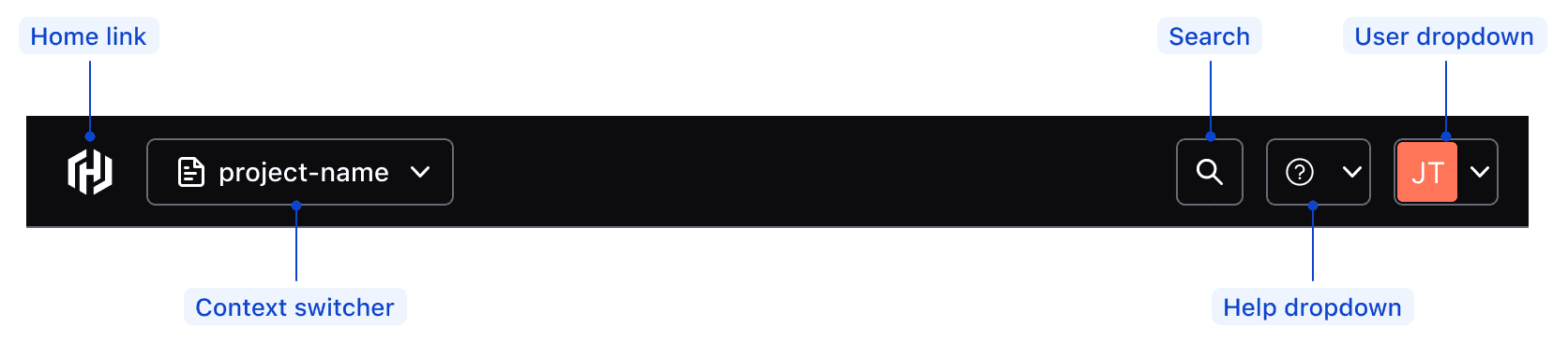
| Element | Usage |
|---|---|
| Global | |
| Home link | Required; supports multiple product logos |
| Context switcher | Optional |
| Utilities | |
| Help dropdown | Optional, but highly recommend (WCAG guidelines) |
| User dropdown | Required |
| Search | Optional |
Small viewports
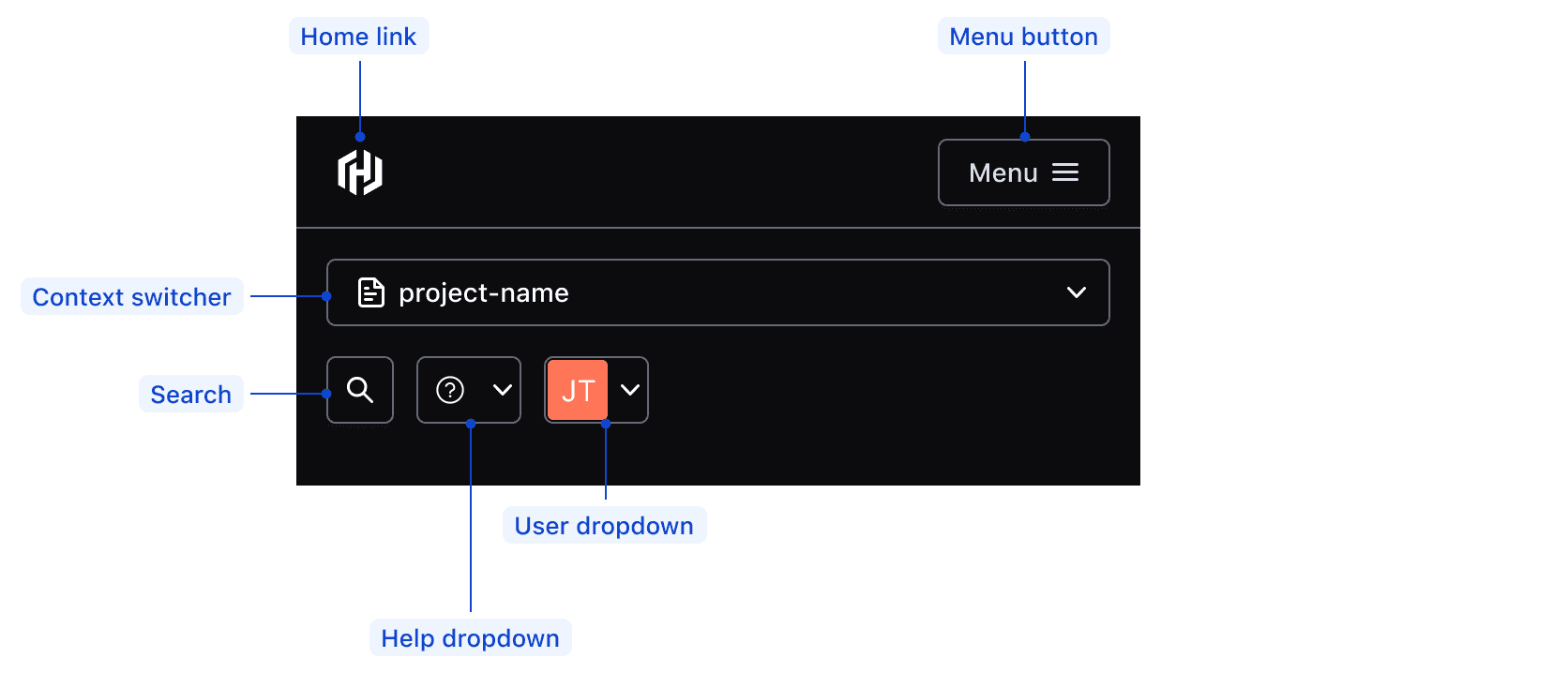
| Element | Usage |
|---|---|
| Home link | Required; supports multiple product logos |
| Menu button | Required |
| Context switcher | Optional |
| Menu | |
| Help dropdown | Optional, but highly recommend (WCAG guidelines) |
| User dropdown | Required |
| Search | Optional |
Conformance rating
When used as recommended, there should not be any WCAG conformance issues with this component.
Focus
When the App Header receives focus via keyboard, the home link should focus as the first interactive element in the DOM (document object model). Then, focus will follow through with the rest of the elements according to their order in the DOM.
Since the App Header is a complex component that holds several nested components and can contain multiple types of content, nested elements must adhere to their individual accessibility criteria.

Applicable WCAG Success Criteria
This section is for reference only. This component intends to conform to the following WCAG Success Criteria:
-
1.1.1
Non-text Content (Level A):
All non-text content that is presented to the user has a text alternative that serves the equivalent purpose. -
1.3.1
Info and Relationships (Level A):
Information, structure, and relationships conveyed through presentation can be programmatically determined or are available in text. -
1.3.2
Meaningful Sequence (Level A):
When the sequence in which content is presented affects its meaning, a correct reading sequence can be programmatically determined. -
1.3.3
Sensory Characteristics (Level A):
Instructions provided for understanding and operating content do not rely solely on sensory characteristics of components such as shape, color, size, visual location, orientation, or sound. -
1.3.4
Orientation (Level AA):
Content does not restrict its view and operation to a single display orientation, such as portrait or landscape. -
1.4.1
Use of Color (Level A):
Color is not used as the only visual means of conveying information, indicating an action, prompting a response, or distinguishing a visual element. -
1.4.10
Reflow (Level AA):
Content can be presented without loss of information or functionality, and without requiring scrolling in two dimensions. -
1.4.11
Non-text Contrast (Level AA):
The visual presentation of the following have a contrast ratio of at least 3:1 against adjacent color(s): user interface components; graphical objects. -
1.4.12
Text Spacing (Level AA):
No loss of content or functionality occurs by setting all of the following and by changing no other style property: line height set to 1.5; spacing following paragraphs set to at least 2x the font size; letter-spacing set at least 0.12x of the font size, word spacing set to at least 0.16 times the font size. -
1.4.13
Content on Hover or Focus (Level AA):
Where receiving and then removing pointer hover or keyboard focus triggers additional content to become visible and then hidden, the following are true: dismissible, hoverable, persistent (see link). -
1.4.3
Minimum Contrast (Level AA):
The visual presentation of text and images of text has a contrast ratio of at least 4.5:1 -
1.4.4
Resize Text (Level AA):
Except for captions and images of text, text can be resized without assistive technology up to 200 percent without loss of content or functionality. -
2.1.1
Keyboard (Level A):
All functionality of the content is operable through a keyboard interface. -
2.1.2
No Keyboard Trap (Level A):
If keyboard focus can be moved to a component of the page using a keyboard interface, then focus can be moved away from that component using only a keyboard interface. -
2.1.4
Character Key Shortcuts (Level A):
If a keyboard shortcut is implemented in content using only letter (including upper- and lower-case letters), punctuation, number, or symbol characters, then it should be able to be turned off, remapped, or active only on focus. -
2.4.3
Focus Order (Level A):
If a Web page can be navigated sequentially and the navigation sequences affect meaning or operation, focusable components receive focus in an order that preserves meaning and operability. -
2.4.7
Focus Visible (Level AA):
Any keyboard operable user interface has a mode of operation where the keyboard focus indicator is visible. -
3.2.1
On Focus (Level A):
When any user interface component receives focus, it does not initiate a change of context. -
3.2.3
Consistent Navigation (Level AA):
Navigational mechanisms that are repeated on multiple Web pages within a set of Web pages occur in the same relative order each time they are repeated. -
3.2.4
Consistent Identification (Level AA):
Components that have the same functionality within a set of Web pages are identified consistently. -
4.1.2
Name, Role, Value (Level A):
For all user interface components, the name and role can be programmatically determined; states, properties, and values that can be set by the user can be programmatically set; and notification of changes to these items is available to user agents, including assistive technologies.
Support
If any accessibility issues have been found within this component, let us know by submitting an issue.
6.1.0
Converted component to gts format.
Removed usage of hdsLinkToModels and hdsLinkToQuery helpers, instead forward the arguments to HdsInteractive.
6.0.0
Fixed issue with disabled styles for nested elements in AppHeader not applying to non-HDS components when AppSideNav is open in mobile view
5.1.0
Optimized CSS used to apply dark theme styles to Buttons & Dropdowns
5.0.0
Fixed the type of @a11yRefocusRouteChangeValidator to match the expected type from ember-a11y-refocus. The new type is (transition: Transition) => boolean instead of string.
4.24.1
Fixed color inheritance for Buttons within DialogPrimitive based components (such as the Modal and Flyout) when triggered from within the AppHeader
4.23.0
return close callback to the :logo named block so the menu actions can be hidden programmatically when the component is in a mobile view.
Fixed classname so that non-active controls in the AppHeader will be styled as disabled when the AppSideNav is expanded and in overlay mode
4.22.0
Changed the default breakpoint from lg to md.
4.21.1
Added close callback to the :globalActions and :utilityActions named blocks so the menu actions can be hidden programmatically when the component is in a mobile view.
4.21.0
Refactored the Home Link, removed the @ariaLabel argument, added @text (should replace @ariaLabel) and @isIconOnly arguments.
4.20.0
Removed usage of --hds-app-desktop-breakpoint CSS variable and relied on the @breakpoint argument for override of mobile behavior
Fixed import path for hds-breakpoints
4.19.0
Formally published the AppHeader component. To be used in conjunction with the AppFrame and the AppSideNav components.
4.15.0
Aligned private class properties to follow a standardized notation
4.10.0
Changed default value of @a11yRefocusSkipTo from "#main" to "#hds-main"
Hid the closed menu content in mobile view using CSS instead of conditionally rendering/not rendering the menu content.
Added NavigationNarrator with associated arguments to provide a "skip link".
Styled inoperable actions as disabled (which occurs when the SideNav is expanded in mobile view)
Fixed styling issue to prevent Button and Dropdown nested within another Dropdown from inheriting dark theme.
Fixed issue with mobile menu to prevent tabbing to hidden content and hiding it from assistive technology when closed.
4.8.0
Added the AppHeader component and its sub-components, but did not publish them for public use.
Also added the following design tokens:
--token-app-header-height--token-app-header-home-link-size--token-app-header-logo-size