An input of type "checkbox" is a form element that allows users to select one or more items from a list of individual items.
Usage
When to use
- To allow users to check or uncheck an option or setting.
- To allow users to select one or more options from a list.
When not to use
- When only one choice can be selected, consider Radio buttons.
- When checking or unchecking results in an immediate change, consider Toggle.
Layout
We recommend using vertical Checkbox groups, especially with short option lists.
Indeterminate state
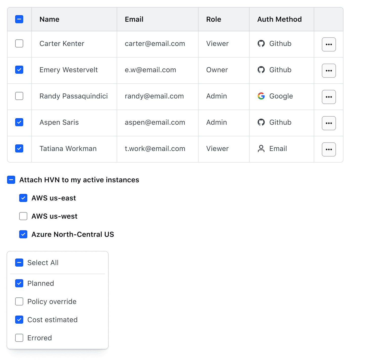
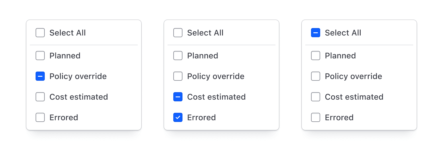
Indeterminate states indicate a "partially checked" condition in nested structures or tables.
Required and optional
For complex forms, indicate required fields. This is the most explicit and transparent method and ensures users don’t have to make assumptions. Read more about best practices for marking required fields in forms.
For shorter, simpler forms (e.g., login/signup and feedback requests), indicate optional fields instead.
Error validation
For error validation recommendations, refer to the Form patterns documentation.
How to use this component
There are three ways to use the Checkbox component:
Form::Checkbox::Base- the base component: the<input>controlForm::Checkbox::Field- the field component: the<input>control, with label, helper text, and error messaging (in a wrapping container)Form::Checkbox::Group- the group component: a<legend>(optional), a list of fields, and error messaging
Form::Checkbox::Group
Use Form::Checkbox::Group when there are multiple related options to choose from, or a single one that needs to be presented with an extra Legend. If there’s a single choice and no need for an extra Legend, use Form::Checkbox::Field.
The basic invocation creates:
- a
<fieldset>container. - a
<legend>element. - a list of rendered
<Form::Checkbox::Field>components.
The @name argument offers an easy way to provide the same name for all the Checkbox controls in a single place.
<Hds::Form::Checkbox::Group @name="demo-datacenter" as |G|>
  <G.Legend>Valid datacenters</G.Legend>
  <G.CheckboxField as |F|>
    <F.Label>NYC1</F.Label>
  </G.CheckboxField>
  <G.CheckboxField as |F|>
    <F.Label>DC1</F.Label>
  </G.CheckboxField>
  <G.CheckboxField as |F|>
    <F.Label>NYC2</F.Label>
  </G.CheckboxField>
  <G.CheckboxField as |F|>
    <F.Label>SF1</F.Label>
  </G.CheckboxField>
</Hds::Form::Checkbox::Group>
Layout
To better fit your spacing requirements, choose between two different layout orientations: vertical or horizontal.
<Hds::Form::Checkbox::Group @name="demo-datacenter" as |G|>
  <G.Legend>Valid datacenters</G.Legend>
  <G.CheckboxField as |F|>
    <F.Label>NYC1</F.Label>
  </G.CheckboxField>
  <G.CheckboxField as |F|>
    <F.Label>DC1</F.Label>
  </G.CheckboxField>
  <G.CheckboxField as |F|>
    <F.Label>NYC2</F.Label>
  </G.CheckboxField>
  <G.CheckboxField as |F|>
    <F.Label>SF1</F.Label>
  </G.CheckboxField>
</Hds::Form::Checkbox::Group><Hds::Form::Checkbox::Group @layout="horizontal" @name="demo-datacenter" as |G|>
<G.Legend>Valid datacenters</G.Legend>
<G.CheckboxField as |F|>
<F.Label>NYC1</F.Label>
</G.CheckboxField>
<G.CheckboxField as |F|>
<F.Label>DC1</F.Label>
</G.CheckboxField>
<G.CheckboxField as |F|>
<F.Label>NYC2</F.Label>
</G.CheckboxField>
<G.CheckboxField as |F|>
<F.Label>SF1</F.Label>
</G.CheckboxField>
</Hds::Form::Checkbox::Group>Extra content in legend and helper text
The Legend and HelperText contextual components used in the Field component yield their content. This means you can also pass structured content.
When helper text is added, the component automatically adds an aria-describedby attribute to the fieldset, associating it with the automatically generated ID.
<Hds::Form::Checkbox::Group @name="demo-methods" as |G|>
  <G.Legend>Methods <Hds::Badge @size="small" @text="Beta" @color="highlight" /></G.Legend>
  <G.HelperText>All methods are applied by default unless specified. See
    <Hds::Link::Inline @href="#">HTTP protocol</Hds::Link::Inline>
    for more details.</G.HelperText>
  <G.CheckboxField checked as |F|>
    <F.Label>POST</F.Label>
  </G.CheckboxField>
  <G.CheckboxField checked as |F|>
    <F.Label>GET</F.Label>
  </G.CheckboxField>
  <G.CheckboxField checked as |F|>
    <F.Label>PUT</F.Label>
  </G.CheckboxField>
</Hds::Form::Checkbox::Group>
Required vs. optional
Use the @isRequired and @isOptional arguments to add a visual indication that the field is “required” or “optional”.
<Hds::Form as |FORM|>
  <FORM.Section>
    <Hds::Form::Checkbox::Group @isRequired={{true}} @layout="horizontal" @name="demo-methods" as |G|>
      <G.Legend>Methods</G.Legend>
      <G.HelperText>All methods are applied by default unless specified.</G.HelperText>
      <G.CheckboxField checked as |F|><F.Label>POST</F.Label></G.CheckboxField>
      <G.CheckboxField checked as |F|><F.Label>GET</F.Label></G.CheckboxField>
      <G.CheckboxField checked as |F|><F.Label>PUT</F.Label></G.CheckboxField>
    </Hds::Form::Checkbox::Group>

    <Hds::Form::Checkbox::Group @isOptional={{true}} @layout="horizontal" @name="demo-methods" as |G|>
      <G.Legend>Methods</G.Legend>
      <G.HelperText>All methods are applied by default unless specified.</G.HelperText>
      <G.CheckboxField checked as |F|><F.Label>POST</F.Label></G.CheckboxField>
      <G.CheckboxField checked as |F|><F.Label>GET</F.Label></G.CheckboxField>
      <G.CheckboxField checked as |F|><F.Label>PUT</F.Label></G.CheckboxField>
    </Hds::Form::Checkbox::Group>
  </FORM.Section>
</Hds::Form>
Validation
To indicate a field is invalid, provide an error message using the Error contextual component.
<Hds::Form::Checkbox::Group @layout="horizontal" @name="demo-datacenter" as |G|>
  <G.Legend>Valid datacenters</G.Legend>
  <G.CheckboxField as |F|>
    <F.Label>NYC1</F.Label>
  </G.CheckboxField>
  <G.CheckboxField as |F|>
    <F.Label>DC1</F.Label>
  </G.CheckboxField>
  <G.CheckboxField as |F|>
    <F.Label>NYC2</F.Label>
  </G.CheckboxField>
  <G.CheckboxField as |F|>
    <F.Label>SF1</F.Label>
  </G.CheckboxField>
  <G.Error>Error: you need to choose at least one datacenter.</G.Error>
</Hds::Form::Checkbox::Group>
Field items
A group of Checkboxes is made of one or more Form::Checkbox::Field components. All the arguments, attributes, and modifiers that can be passed to Form::Checkbox::Field can be passed to the same items in the Group declaration.
<Hds::Form::Checkbox::Group @layout="vertical" @name="demo-datacenter" as |G|>
  <G.Legend>Valid datacenters</G.Legend>
  <G.CheckboxField
    name="datacenter1"
    @id="datacenter-NYC1"
    @value="NYC1"
    {{on "change" this.yourOnChangeFunction}}
    as |F|
  >
    <F.Label>NYC1</F.Label>
    <F.HelperText>CoreSite- 32 Avenue of the Americas</F.HelperText>
  </G.CheckboxField>
  <G.CheckboxField
    name="datacenter2"
    @id="datacenter-DC1"
    checked
    @value="DC1"
    {{on "change" this.yourOnChangeFunction}}
    as |F|
  >
    <F.Label>DC1</F.Label>
    <F.HelperText>CoreSite- K Street</F.HelperText>
  </G.CheckboxField>
  <G.CheckboxField
    name="datacenter3"
    @id="datacenter-NYC2"
    checked
    @value="NYC2"
    {{on "change" this.yourOnChangeFunction}}
    as |F|
  >
    <F.Label>NYC2</F.Label>
    <F.HelperText>H5 Data Center - 325 Hudson Street</F.HelperText>
  </G.CheckboxField>
  <G.CheckboxField
    name="datacenter4"
    @id="datacenter-SF1"
    @value="SF1"
    {{on "change" this.yourOnChangeFunction}}
    as |F|
  >
    <F.Label>SF1</F.Label>
    <F.HelperText>INAP - 650 Townsend Street</F.HelperText>
  </G.CheckboxField>
</Hds::Form::Checkbox::Group>
Group with a single choice
There may be use cases in which you need to create a Checkbox group that contains a single field element (e.g., to show the Legend in a similar position for other control’s labels).
<Hds::Form::Checkbox::Group @name="demo-visibility" as |G|>
  <G.Legend>Visibility</G.Legend>
  <G.CheckboxField name="private" @id="visibility-private" as |F|>
    <F.Label>Private</F.Label>
    <F.HelperText>Making a box private prevents users from accessing it unless given permission.</F.HelperText>
  </G.CheckboxField>
</Hds::Form::Checkbox::Group>
Form::Checkbox::Field
The field variant of the Checkbox component is to be used when there’s a single choice to make for the user. If there are multiple related choices, use Form::Checkbox::Group.
The basic invocation requires a Label. This creates:
- a
<label>element with aforattribute automatically associated with the inputIDattribute. - an
<input type="checkbox">control with an automatically generatedIDattribute.
<Hds::Form::Checkbox::Field name="demo-cost-estimation" as |F|>
  <F.Label>Enable cost estimation</F.Label>
</Hds::Form::Checkbox::Field>
Input value
Pass a @value argument to the checkbox input.
<Hds::Form::Checkbox::Field @value="enable" name="demo-cost-estimation" as |F|>
  <F.Label>Enable cost estimation</F.Label>
</Hds::Form::Checkbox::Field>
Checked
Use the standard HTML checked attribute to mark the input as checked.
<Hds::Form::Checkbox::Field checked name="demo-cost-estimation" as |F|>
  <F.Label>Enable cost estimation</F.Label>
</Hds::Form::Checkbox::Field>
Indeterminate
In addition to the checked and unchecked states, a checkbox can be in an indeterminate state, also referred to as partially checked state. A common use case for this state is when a parent checkbox allows the user to select multiple child checkboxes at once. The visual appearance of the checkbox is determined based on the indeterminate attribute.
<Hds::Form::Checkbox::Field indeterminate={{true}} name="demo-all-datacenters" as |F|>
  <F.Label>All datacenters</F.Label>
</Hds::Form::Checkbox::Field>
Extra content in legend and helper text
The Label and HelperText contextual components used in the Field component yield their content. This means you can also pass structured content.
When helper text is added, the component automatically adds an aria-describedby attribute to the fieldset, associating it with the automatically generated ID.
<Hds::Form::Checkbox::Field name="demo-enable-cost-estimation" as |F|>
  <F.Label>Enable cost estimation <Hds::Badge @size="small" @text="Beta" @color="highlight" /></F.Label>
  <F.HelperText>See <Hds::Link::Inline @href="#">our pricing</Hds::Link::Inline> for more information.</F.HelperText>
</Hds::Form::Checkbox::Field>
Validation
To indicate a field is invalid, provide an error message using the Error contextual component.
<Hds::Form::Checkbox::Field name="demo-approve-change" as |F|>
  <F.Label>I approve the changes.</F.Label>
  <F.Error>
    Error: it is necessary to explicitly approve the changes to continue.
  </F.Error>
</Hds::Form::Checkbox::Field>
Custom control ID
If needing a custom ID for the control instead of the one automatically generated by the component, pass the @id argument to the field.
In this case all the internal references (id/for/aria-describedby) between the different parts of the field are still automatically generated and will use the custom ID provided.
<Hds::Form::Checkbox::Field @id="my-control" name="demo-cost-estimation" as |F|>
  <F.Label>Enable cost estimation</F.Label>
  <F.HelperText>
    With this option enabled you will receive an approximate cost estimation.
  </F.HelperText>
</Hds::Form::Checkbox::Field>
Additional aria-describedby
Pass an @extraAriaDescribedBy argument to the field to connect one or more extra elements describing the field to the control. This provides extra ID values to the aria-describedby attribute of the control, in addition to those automatically generated by the component.
<Hds::Form::Checkbox::Field @extraAriaDescribedBy="my-extra-element-ID" name="demo-cost-estimation" as |F|>
  <F.Label>Enable cost estimation</F.Label>
  <F.HelperText>
    With this option enabled you will receive an approximate cost estimation.
  </F.HelperText>
</Hds::Form::Checkbox::Field>
HTML native attributes
This component supports use of ...attributes. This means you can use all the standard HTML attributes of the <input> element. This can be useful in case you want to add specific native behaviors to the field, that are not exposed directly by the component (e.g., providing a name for the control).
<Hds::Form::Checkbox::Field name="demo-cost-estimation" as |F|>
  <F.Label>Enable cost estimation</F.Label>
</Hds::Form::Checkbox::Field>
Events handling
Because this component supports use of ...attributes, you can use all the usual Ember techniques for event handling (e.g., input, change), validation, etc.
<Hds::Form::Checkbox::Field name="demo-cost-estimation" {{on "change" this.yourOnChangeFunction}} as |F|>
  <F.Label>Enable cost estimation</F.Label>
</Hds::Form::Checkbox::Field>
Form::Checkbox::Base
The Base element is intended for rare cases where the Field or Group components can’t be used and a custom implementation is needed. Most of the details for the Field component also apply to the Base component, but see the Component API for more details.
A basic invocation creates an <input type="checkbox"> control with an automatically generated ID attribute.