The page navigation is complete. You may now navigate the page content as you wish.
Skip to main content

Masked Input

Updated in v6.2.0

A form input that visually obfuscates characters to protect sensitive information by replacing them with a shape.

Code consideration

This component is meant for visual obfuscation only. Consumers should be aware that the hidden text value could still be obtained through other means (e.g., copying it from the input, via JavaScript, via the developer tools, etc.).

A Masked Input field is a special input that visually obfuscates characters to protect sensitive information by masking them with a circular shape.

Usage

When to use

  • To give users a way to show and hide sensitive information.

  • When a form input with the ability to mask its value temporarily is needed.

When not to use

Masked input vs Password input

The Masked Input is a text field designed to protect sensitive or confidential information while allowing users to show or hide the input value as needed.

The password input is a specific type of form control designed for the secure entry of passwords. The value is always masked or hidden to prevent others from reading the entered characters easily. Unlike the Masked Input, the password input has specific attributes to enhance the security and confidentiality of passwords.

Usage examples

Do

Use the Masked Input to protect sensitive values like secret keys or tokens.
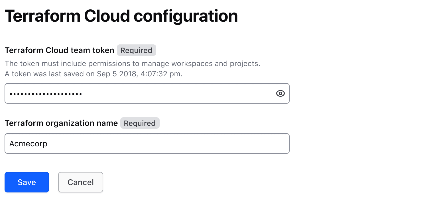
Form with a masked input

Do

Use the Masked Input to protect sensitive values like variables and certificates from unintended exposure.
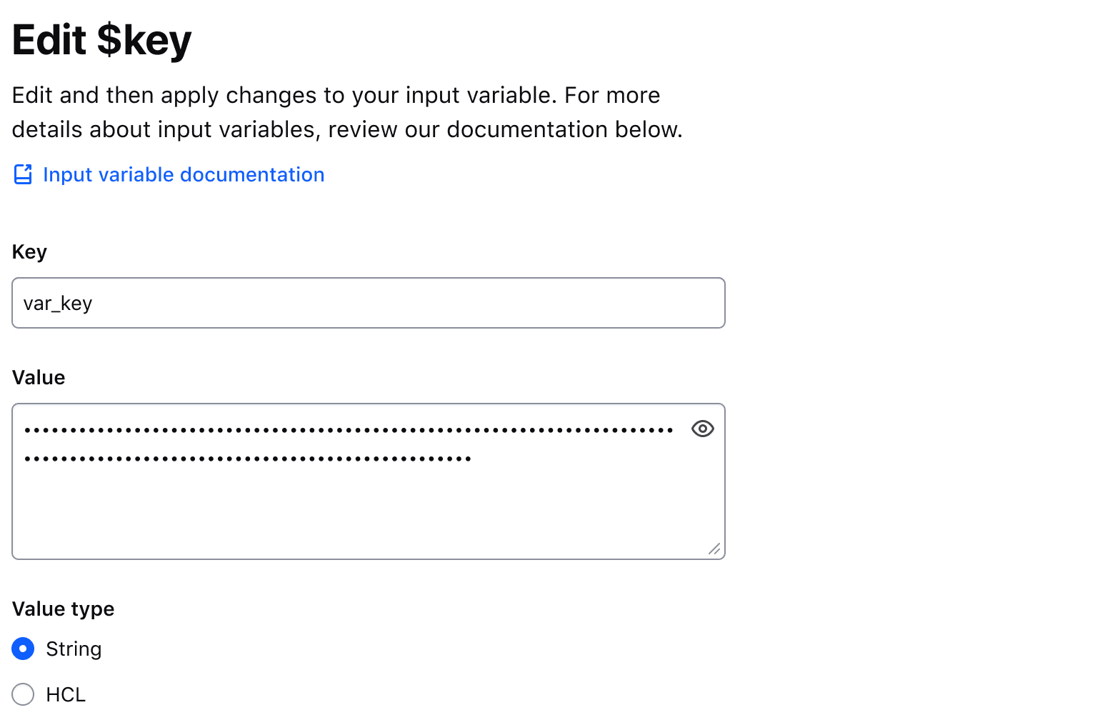
Form with a multiline masked input

Don’t

Don’t use a Masked Input for password input. Use the Password input.
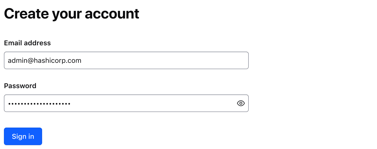
Form with a masked input

Multiline

Use isMultiline to display multiline textual content. e.g., a Terraform variable. This property replaces the TextInput with a Textarea field.

Required and optional

For complex forms, indicate required fields. This is the most explicit and transparent method and ensures users don’t have to make assumptions. Read more about best practices for marking required fields in forms.

For shorter, simpler forms, indicate optional fields instead.

Copying the Masked Input value

Setting the hasCopyButton property to true will display a Copy Button adjacent to the Masked Input, allowing users to copy the value in the Masked Input to their clipboard. Refer to the Copy Button usage guidelines for more details around copying content.

Character Count

Consumer responsibility

The character count is not coupled with the invalid state of the field. Instead, it is the responsibility of the consumer to implement validation at the application-level.

Use a character count to communicate the current length of the value in an input and whether it meets or exceeds the length requirements passed to the component. The component accepts multiple arguments to set length requirements and exposes several computed values to support custom messages. Visit the primitive code documentation for more details.

Default messages

Depending on which property (or properties) are passed to the component, a different default message will be displayed by the component to communicate the relationship between the current length of the input value (currentLength) and the maximum length (maxLength), minimum length (minLength), or both.

Test and interact with the default messaging examples in the primitive code documentation.

The default messages provide a consistent messaging pattern for the component by clearly communicating length requirements to the user while displaying their progress towards meeting the requirements.

A workspace name input with the text "work" entered. If the character count is showing current length, it reads "4 characters entered". If maximum length, it reads "21 characters remaining". If minimum length, it reads "1 character remaining".

Usage in Figma

For representative consistency, the Figma component mirrors the default messages that are rendered in the Ember component and are labelled as such; currentLength (the default variant), maxLength, minLength, and custom.

In all variants except the custom variant, we recommend only overriding the numerical value (e.g., "{numerical value} characters is allowed"). Overriding the text in these variants will require a custom implementation on the engineering side, instead, the custom variant should be used.

Custom messages

A custom message in the character count is supported and can be used when a product or application-specific message or term is required, e.g., "registry" or "workspace".

Don’t

Avoid presenting duplicate information between the helper text and the character count. Helper text should be used to provide persistent requirements while character count represents more of a progress indicator towards a length requirement.

Workspace name input where the helper text says there is a 5 character minimum and the character count below the input also says there is a 5 character minimum.

Don’t

Don’t use the character count to display static details about the field. Use helper text to provide extra details about the information being requested and the character count to communicate the user’s progress toward meeting the requirements.

Error validation

For error validation recommendations, refer to the Form patterns documentation.

How to use this component

There are two ways to use the Masked Input component:

  • Form::MaskedInput::Base - the base component: the input control with a toggle button.
  • Form::MaskedInput::Field - the field component: the input control with a toggle button, a label, helper text, and error messaging (in a wrapping container).

We recommend using the Field component as it provides built-in accessibility functionality. Use the Base component to achieve custom layouts or for special use cases not covered by the Field component.

Form::MaskedInput::Field

The basic invocation requires a Label. This creates:

  • a <label> element with a for attribute automatically associated with the input ID attribute.
  • a <input type="text"> or a <textarea> control with an automatically generated ID attribute.
\n \n \n \n
\n \n
\n \n \n \n \n \n
<Hds::Form::MaskedInput::Field name="demo-team-token" as |F|>
  <F.Label>Terraform Cloud team token</F.Label>
</Hds::Form::MaskedInput::Field>

Input value

Pass a @value argument to pre-populate the input. By default, the content is visually obfuscated ("masked") and users can make it visible using the associated toggle button.

\n \n \n \n
\n \n
\n \n \n \n \n \n
<Hds::Form::MaskedInput::Field @value="036215df4996ca649928d8864b4df9e42cba0d6d" name="demo-team-token" as |F|>
  <F.Label>Terraform Cloud team token</F.Label>
</Hds::Form::MaskedInput::Field>

If you need to make the content visible by default or control the masking from outside the component, use the @isContentMasked argument.

Error rendering the dynamic template

There was an error rendering the dynamic template for this page.
Check the console to see the details of the error.

If you need support or want to notify the Design Systems Team of this error, please contact us.

<Hds::Form::MaskedInput::Field
  @isContentMasked={{false}}
  @value="036215df4996ca649928d8864b4df9e42cba0d6d"
  name="demo-team-token"
  as |F|
>
  <F.Label>Terraform Cloud team token</F.Label>
</Hds::Form::MaskedInput::Field>

Multiline

Code consideration

When the multiline input is masked, the browser converts newline characters to masked characters: this means that the multiline text will appear as a single long string of characters, even if it’s inside a <textarea> element.

When the text is not masked, the newline characters will be respected. This means it may occupy more lines than when it’s masked (see the example above).

Something to keep in mind when designing and implementing functionality that makes use of this component.

Set @isMultiline argument to true to render a <textarea>

Error rendering the dynamic template

There was an error rendering the dynamic template for this page.
Check the console to see the details of the error.

If you need support or want to notify the Design Systems Team of this error, please contact us.

<Hds::Form::MaskedInput::Field
  @isMultiline={{true}}
  @value="-----BEGIN RSA PRIVATE KEY-----
MIIBOgIBAAJBAKj34GkxFhD90vcNLYLInFEX6Ppy1tPf9Cnzj4p4WGeKLs1Pt8Qu
KUpRKfFLfRYC9AIKjbJTWit+CqvjWYzvQwECAwEAAQJAIJLixBy2qpFoS4DSmoEm
o3qGy0t6z09AIJtH+5OeRV1be+N4cDYJKffGzDa88vQENZiRm0GRq6a+HPGQMd2k
TQIhAKMSvzIBnni7ot/OSie2TmJLY4SwTQAevXysE2RbFDYdAiEBCUEaRQnMnbp7
9mxDXDf6AU0cN/RPBjb9qSHDcWZHGzUCIG2Es59z8ugGrDY+pxLQnwfotadxd+Uy
v/Ow5T0q5gIJAiEAyS4RaI9YG8EWx/2w0T67ZUVAw8eOMB6BIUg0Xcu+3okCIBOs
/5OiPgoTdSy7bcF9IGpSE8ZgGKzgYQVZeN97YE00
-----END RSA PRIVATE KEY-----"
  name="demo-private-key"
  as |F|
>
  <F.Label>Private key</F.Label>
</Hds::Form::MaskedInput::Field>

Copy button

To allow users to copy the input value to their clipboard, set the @hasCopyButton argument to true.

Error rendering the dynamic template

There was an error rendering the dynamic template for this page.
Check the console to see the details of the error.

If you need support or want to notify the Design Systems Team of this error, please contact us.

<Hds::Form::MaskedInput::Field
  @hasCopyButton={{true}}
  @value="036215df4996ca649928d8864b4df9e42cba0d6d"
  name="demo-team-token"
  as |F|
>
  <F.Label>Terraform Cloud team token</F.Label>
</Hds::Form::MaskedInput::Field>

Helper text

You can add extra information to the field using helper text. When helper text is added, the component automatically adds an aria-describedby attribute to the input control, associating it with the automatically generated ID of the helper text element.

\n \n \n \n \n
The token must include permissions to manage workspaces and projects.
\n
\n \n \n
\n \n \n \n \n \n \n \n \n
<Hds::Form::MaskedInput::Field @value="036215df4996ca649928d8864b4df9e42cba0d6d" name="demo-team-token" as |F|>
  <F.Label>Terraform Cloud team token</F.Label>
  <F.HelperText>The token must include permissions to manage workspaces and projects.</F.HelperText>
</Hds::Form::MaskedInput::Field>

Extra content in label and helper text

Accessibility consideration

If a link is used within a label, helper text, or error text, it will not be presented as a link to the user with a screen reader; only the text content is read out. As such, care should be used when considering this feature. If needing to use a link, include a screen reader-only message that informs the user that some help text includes links, and additional keyboard exploration may be required.

The Label and HelperText contextual components used in the Field component yield their content. This means you can also pass structured content.

\n \n \n \n \n \n
\n \n \n
\n \n \n \n \n \n \n \n \n
<Hds::Form::MaskedInput::Field name="demo-team-token" as |F|>
  <F.Label>Terraform Cloud team token <Hds::Badge @size="small" @text="Beta" /></F.Label>
  <F.HelperText>The token must include
    <Hds::Link::Inline @href="#">permissions to manage workspaces and projects</Hds::Link::Inline>.</F.HelperText>
</Hds::Form::MaskedInput::Field>

Required vs. optional

Use the @isRequired and @isOptional arguments to add a visual indication that the field is "required" or "optional".

\n
\n
\n \n \n \n \n
The token must include permissions to manage workspaces and projects.
\n
\n \n \n
\n \n \n \n \n \n \n \n \n
\n\n
\n \n \n \n \n
The token must include permissions to manage workspaces and projects.
\n
\n \n \n
\n \n \n \n \n \n \n \n \n
\n
\n
<Hds::Form as |FORM|>
  <FORM.Section>
    <Hds::Form::MaskedInput::Field @isRequired={{true}} name="demo-team-token" as |F|>
      <F.Label>Terraform Cloud team token</F.Label>
      <F.HelperText>The token must include permissions to manage workspaces and projects.</F.HelperText>
    </Hds::Form::MaskedInput::Field>

    <Hds::Form::MaskedInput::Field @isOptional={{true}} name="demo-team-token" as |F|>
      <F.Label>Terraform Cloud team token</F.Label>
      <F.HelperText>The token must include permissions to manage workspaces and projects.</F.HelperText>
    </Hds::Form::MaskedInput::Field>
  </FORM.Section>
</Hds::Form>

Character count

If the user input needs to be limited to a certain number of characters, use @maxLength on a CharacterCount contextual component to guide the user in meeting the length requirements. This property does not restrict the users from entering characters over the limit. To define the maximum string length that the user can enter, set maxlength attribute on the associated input field.

\n \n \n \n \n \n
\n \n \n
\n \n \n \n \n
2 characters remaining
\n \n \n \n
<Hds::Form::MaskedInput::Field @value={{this.value}} name="demo-team-token" {{on "input" this.updateValue}} as |F|>
  <F.Label>Terraform Cloud team token</F.Label>
  <F.CharacterCount @maxLength={{40}} />
</Hds::Form::MaskedInput::Field>

If the user input is required to have a certain number of characters, use @minLength on a CharacterCount contextual component to guide the user in meeting the length requirements.

\n \n \n \n \n \n
\n \n \n
\n \n \n \n \n
7 more characters required
\n \n \n \n
<Hds::Form::MaskedInput::Field @value={{this.value}} name="demo-team-token" {{on "input" this.updateValue}} as |F|>
  <F.Label>Terraform Cloud team token</F.Label>
  <F.CharacterCount @minLength={{30}} />
</Hds::Form::MaskedInput::Field>

When the user input needs to be in a certain range, use both @minLength and @maxLength on a CharacterCount contextual component to guide the user in meeting the length requirements.

\n \n \n \n \n \n
\n \n \n
\n \n \n \n \n
2 characters remaining
\n \n \n \n
<Hds::Form::MaskedInput::Field @value={{this.value}} name="demo-team-token" {{on "input" this.updateValue}} as |F|>
  <F.Label>Terraform Cloud team token</F.Label>
  <F.CharacterCount @minLength={{30}} @maxLength={{40}} />
</Hds::Form::MaskedInput::Field>
Custom message

For custom messages, you can use the following arguments to build a relevant message: currentLength (the current number of characters in the associated form control), maxLength (the maximum number of characters allowed in the associated form control), minLength (the minimum number of characters required in the associated form control), remaining (the difference between maxLength and currentLength), and shortfall (the difference between currentLength and minLength).

\n \n \n \n \n \n
\n \n \n
\n \n \n \n \n
\n You have\n 2\n characters remaining\n
\n \n \n \n
<Hds::Form::MaskedInput::Field @value={{this.value}} name="demo-team-token" {{on "input" this.updateValue}} as |F|>
  <F.Label>Terraform Cloud team token</F.Label>
  <F.CharacterCount @maxLength={{40}} as |CC|>
    You have
    {{CC.remaining}}
    characters remaining
  </F.CharacterCount>
</Hds::Form::MaskedInput::Field>
Validation based on length

You can raise an error based on the number of characters entered into a field using a custom validation function.

Error rendering the dynamic template

There was an error rendering the dynamic template for this page.
Check the console to see the details of the error.

If you need support or want to notify the Design Systems Team of this error, please contact us.

<Hds::Form::MaskedInput::Field
  @value={{this.value}}
  @isInvalid={{this.fieldIsInvalid}}
  name="demo-team-token"
  {{on "input" this.updateValue}}
  as |F|
>
  <F.Label>Terraform Cloud team token</F.Label>
  <F.CharacterCount @minLength={{this.minLength}} />
  {{#if this.fieldIsInvalid}}
    <F.Error>Length should be at least 40 characters</F.Error>
  {{/if}}
</Hds::Form::MaskedInput::Field>

Validation

To indicate a field is invalid, use the @isInvalid argument and provide an error message using the Error contextual component.

Error rendering the dynamic template

There was an error rendering the dynamic template for this page.
Check the console to see the details of the error.

If you need support or want to notify the Design Systems Team of this error, please contact us.

<Hds::Form::MaskedInput::Field
  @isInvalid={{true}}
  name="demo-team-token"
  @value="036215df4996ca649928d8864b4df9e42cba0d6d"
  as |F|
>
  <F.Label>Terraform Cloud team token</F.Label>
  <F.Error>The provided token is not valid</F.Error>
</Hds::Form::MaskedInput::Field>

Add more than one error message using the more specific Message contextual component.

\n \n \n \n \n \n
\n \n \n
\n \n \n \n \n \n \n \n
\n

Length should be at least 40 characters

\n

Should not contain special characters or spaces

\n
\n
<Hds::Form::MaskedInput::Field @isInvalid={{true}} name="demo-team-token" @value="036215df4996c649928d8864b4" as |F|>
  <F.Label>Terraform Cloud team token</F.Label>
  <F.Error as |E|>
    <E.Message>Length should be at least 40 characters</E.Message>
    <E.Message>Should not contain special characters or spaces</E.Message>
  </F.Error>
</Hds::Form::MaskedInput::Field>

Custom control ID

If a custom ID is needed for the control instead of the one automatically generated by the component, pass the @id argument to the field.

In this case, all the internal references (id/for/aria-describedby) between the different parts of the field are still automatically generated and will use the custom ID provided.

\n \n \n \n
\n \n
\n \n \n \n \n \n
<Hds::Form::MaskedInput::Field @id="tfc-token" name="demo-team-token" as |F|>
  <F.Label>Terraform Cloud team token</F.Label>
</Hds::Form::MaskedInput::Field>

Additional aria-describedby

Pass an @extraAriaDescribedBy argument to the field to connect one or more extra elements describing the field to the control. This provides extra ID values to the aria-describedby attribute of the control, in addition to those automatically generated by the component.

\n \n \n \n
\n \n
\n \n \n \n \n \n
<Hds::Form::MaskedInput::Field @extraAriaDescribedBy="my-extra-element-ID" name="demo-team-token" as |F|>
  <F.Label>Terraform Cloud team token</F.Label>
</Hds::Form::MaskedInput::Field>

HTML native attributes

This component supports use of ...attributes. This means you can use all the standard HTML attributes of the input control element. This can be useful in case you want to add specific native behaviors to the field, that are not exposed directly by the component (e.g., providing a name for the control, or adding min, max, minlength, maxlength, or pattern attributes to it).

\n \n \n \n
\n \n
\n \n \n \n \n \n
<Hds::Form::MaskedInput::Field minlength="40" maxlength="40" name="demo-team-token" as |F|>
  <F.Label>Terraform Cloud team token</F.Label>
</Hds::Form::MaskedInput::Field>

Events handling

This component supports the use of ...attributes, which allows you to use all the usual Ember techniques for event handling (e.g., input, blur, change), validation, etc.

\n \n \n \n
\n \n
\n \n \n \n \n \n
<Hds::Form::MaskedInput::Field name="demo-team-token" {{on "blur" this.yourOnBlurFunction}} as |F|>
  <F.Label>Terraform Cloud team token</F.Label>
</Hds::Form::MaskedInput::Field>

Custom width

By default, the input control width is set to fill the parent container.

Pass a custom width for the control using the @width argument.

\n \n \n \n
\n \n
\n \n \n \n \n \n
<Hds::Form::MaskedInput::Field @width="250px" name="demo-team-token" as |F|>
  <F.Label>Terraform Cloud team token</F.Label>
</Hds::Form::MaskedInput::Field>

Form::MaskedInput::Base

Form::MaskedInput::Base does not come with built-in accessibility functionality. It is the responsibility of the product team to ensure the implementation is conformant.

The Base component is intended for rare cases where the Field component can’t be used and a custom implementation is needed. Most of the details for the Field component also apply to the Base component, but see the Component API for more details.

The default invocation creates a <input type="text"> or a <textarea> control with an automatically generated ID attribute.

The page navigation is complete. You may now navigate the page content as you wish.
Skip to main content

Masked Input

Updated in v6.2.0

A form input that visually obfuscates characters to protect sensitive information by replacing them with a shape.

Code consideration

This component is meant for visual obfuscation only. Consumers should be aware that the hidden text value could still be obtained through other means (e.g., copying it from the input, via JavaScript, via the developer tools, etc.).

A Masked Input field is a special input that visually obfuscates characters to protect sensitive information by masking them with a circular shape.

Usage

When to use

  • To give users a way to show and hide sensitive information.

  • When a form input with the ability to mask its value temporarily is needed.

When not to use

Masked input vs Password input

The Masked Input is a text field designed to protect sensitive or confidential information while allowing users to show or hide the input value as needed.

The password input is a specific type of form control designed for the secure entry of passwords. The value is always masked or hidden to prevent others from reading the entered characters easily. Unlike the Masked Input, the password input has specific attributes to enhance the security and confidentiality of passwords.

Usage examples

Do

Use the Masked Input to protect sensitive values like secret keys or tokens.

Form with a masked input

Do

Use the Masked Input to protect sensitive values like variables and certificates from unintended exposure.

Form with a multiline masked input

Don’t

Don’t use a Masked Input for password input. Use the Password input.

Form with a masked input

Multiline

Use isMultiline to display multiline textual content. e.g., a Terraform variable. This property replaces the TextInput with a Textarea field.

Required and optional

For complex forms, indicate required fields. This is the most explicit and transparent method and ensures users don’t have to make assumptions. Read more about best practices for marking required fields in forms.

For shorter, simpler forms, indicate optional fields instead.

Copying the Masked Input value

Setting the hasCopyButton property to true will display a Copy Button adjacent to the Masked Input, allowing users to copy the value in the Masked Input to their clipboard. Refer to the Copy Button usage guidelines for more details around copying content.

Character Count

Consumer responsibility

The character count is not coupled with the invalid state of the field. Instead, it is the responsibility of the consumer to implement validation at the application-level.

Use a character count to communicate the current length of the value in an input and whether it meets or exceeds the length requirements passed to the component. The component accepts multiple arguments to set length requirements and exposes several computed values to support custom messages. Visit the primitive code documentation for more details.

Default messages

Depending on which property (or properties) are passed to the component, a different default message will be displayed by the component to communicate the relationship between the current length of the input value (currentLength) and the maximum length (maxLength), minimum length (minLength), or both.

Test and interact with the default messaging examples in the primitive code documentation.

The default messages provide a consistent messaging pattern for the component by clearly communicating length requirements to the user while displaying their progress towards meeting the requirements.

A workspace name input with the text "work" entered. If the character count is showing current length, it reads "4 characters entered". If maximum length, it reads "21 characters remaining". If minimum length, it reads "1 character remaining".

Usage in Figma

For representative consistency, the Figma component mirrors the default messages that are rendered in the Ember component and are labelled as such; currentLength (the default variant), maxLength, minLength, and custom.

In all variants except the custom variant, we recommend only overriding the numerical value (e.g., "{numerical value} characters is allowed"). Overriding the text in these variants will require a custom implementation on the engineering side, instead, the custom variant should be used.

Custom messages

A custom message in the character count is supported and can be used when a product or application-specific message or term is required, e.g., "registry" or "workspace".

Don’t

Avoid presenting duplicate information between the helper text and the character count. Helper text should be used to provide persistent requirements while character count represents more of a progress indicator towards a length requirement.

Workspace name input where the helper text says there is a 5 character minimum and the character count below the input also says there is a 5 character minimum.

Don’t

Don’t use the character count to display static details about the field. Use helper text to provide extra details about the information being requested and the character count to communicate the user’s progress toward meeting the requirements.

Error validation

For error validation recommendations, refer to the Form patterns documentation.

How to use this component

There are two ways to use the Masked Input component:

  • Form::MaskedInput::Base - the base component: the input control with a toggle button.
  • Form::MaskedInput::Field - the field component: the input control with a toggle button, a label, helper text, and error messaging (in a wrapping container).

We recommend using the Field component as it provides built-in accessibility functionality. Use the Base component to achieve custom layouts or for special use cases not covered by the Field component.

Form::MaskedInput::Field

The basic invocation requires a Label. This creates:

  • a <label> element with a for attribute automatically associated with the input ID attribute.
  • a <input type="text"> or a <textarea> control with an automatically generated ID attribute.
\n \n \n \n
\n \n
\n \n \n \n \n \n
<Hds::Form::MaskedInput::Field name="demo-team-token" as |F|>
  <F.Label>Terraform Cloud team token</F.Label>
</Hds::Form::MaskedInput::Field>

Input value

Pass a @value argument to pre-populate the input. By default, the content is visually obfuscated ("masked") and users can make it visible using the associated toggle button.

\n \n \n \n
\n \n
\n \n \n \n \n \n
<Hds::Form::MaskedInput::Field @value="036215df4996ca649928d8864b4df9e42cba0d6d" name="demo-team-token" as |F|>
  <F.Label>Terraform Cloud team token</F.Label>
</Hds::Form::MaskedInput::Field>

If you need to make the content visible by default or control the masking from outside the component, use the @isContentMasked argument.

Error rendering the dynamic template

There was an error rendering the dynamic template for this page.
Check the console to see the details of the error.

If you need support or want to notify the Design Systems Team of this error, please contact us.

<Hds::Form::MaskedInput::Field
  @isContentMasked={{false}}
  @value="036215df4996ca649928d8864b4df9e42cba0d6d"
  name="demo-team-token"
  as |F|
>
  <F.Label>Terraform Cloud team token</F.Label>
</Hds::Form::MaskedInput::Field>

Multiline

Code consideration

When the multiline input is masked, the browser converts newline characters to masked characters: this means that the multiline text will appear as a single long string of characters, even if it’s inside a <textarea> element.

When the text is not masked, the newline characters will be respected. This means it may occupy more lines than when it’s masked (see the example above).

Something to keep in mind when designing and implementing functionality that makes use of this component.

Set @isMultiline argument to true to render a <textarea>

Error rendering the dynamic template

There was an error rendering the dynamic template for this page.
Check the console to see the details of the error.

If you need support or want to notify the Design Systems Team of this error, please contact us.

<Hds::Form::MaskedInput::Field
  @isMultiline={{true}}
  @value="-----BEGIN RSA PRIVATE KEY-----
MIIBOgIBAAJBAKj34GkxFhD90vcNLYLInFEX6Ppy1tPf9Cnzj4p4WGeKLs1Pt8Qu
KUpRKfFLfRYC9AIKjbJTWit+CqvjWYzvQwECAwEAAQJAIJLixBy2qpFoS4DSmoEm
o3qGy0t6z09AIJtH+5OeRV1be+N4cDYJKffGzDa88vQENZiRm0GRq6a+HPGQMd2k
TQIhAKMSvzIBnni7ot/OSie2TmJLY4SwTQAevXysE2RbFDYdAiEBCUEaRQnMnbp7
9mxDXDf6AU0cN/RPBjb9qSHDcWZHGzUCIG2Es59z8ugGrDY+pxLQnwfotadxd+Uy
v/Ow5T0q5gIJAiEAyS4RaI9YG8EWx/2w0T67ZUVAw8eOMB6BIUg0Xcu+3okCIBOs
/5OiPgoTdSy7bcF9IGpSE8ZgGKzgYQVZeN97YE00
-----END RSA PRIVATE KEY-----"
  name="demo-private-key"
  as |F|
>
  <F.Label>Private key</F.Label>
</Hds::Form::MaskedInput::Field>

Copy button

To allow users to copy the input value to their clipboard, set the @hasCopyButton argument to true.

Error rendering the dynamic template

There was an error rendering the dynamic template for this page.
Check the console to see the details of the error.

If you need support or want to notify the Design Systems Team of this error, please contact us.

<Hds::Form::MaskedInput::Field
  @hasCopyButton={{true}}
  @value="036215df4996ca649928d8864b4df9e42cba0d6d"
  name="demo-team-token"
  as |F|
>
  <F.Label>Terraform Cloud team token</F.Label>
</Hds::Form::MaskedInput::Field>

Helper text

You can add extra information to the field using helper text. When helper text is added, the component automatically adds an aria-describedby attribute to the input control, associating it with the automatically generated ID of the helper text element.

\n \n \n \n \n
The token must include permissions to manage workspaces and projects.
\n
\n \n \n
\n \n \n \n \n \n \n \n \n
<Hds::Form::MaskedInput::Field @value="036215df4996ca649928d8864b4df9e42cba0d6d" name="demo-team-token" as |F|>
  <F.Label>Terraform Cloud team token</F.Label>
  <F.HelperText>The token must include permissions to manage workspaces and projects.</F.HelperText>
</Hds::Form::MaskedInput::Field>

Extra content in label and helper text

Accessibility consideration

If a link is used within a label, helper text, or error text, it will not be presented as a link to the user with a screen reader; only the text content is read out. As such, care should be used when considering this feature. If needing to use a link, include a screen reader-only message that informs the user that some help text includes links, and additional keyboard exploration may be required.

The Label and HelperText contextual components used in the Field component yield their content. This means you can also pass structured content.

\n \n \n \n \n \n
\n \n \n
\n \n \n \n \n \n \n \n \n
<Hds::Form::MaskedInput::Field name="demo-team-token" as |F|>
  <F.Label>Terraform Cloud team token <Hds::Badge @size="small" @text="Beta" /></F.Label>
  <F.HelperText>The token must include
    <Hds::Link::Inline @href="#">permissions to manage workspaces and projects</Hds::Link::Inline>.</F.HelperText>
</Hds::Form::MaskedInput::Field>

Required vs. optional

Use the @isRequired and @isOptional arguments to add a visual indication that the field is "required" or "optional".

\n
\n
\n \n \n \n \n
The token must include permissions to manage workspaces and projects.
\n
\n \n \n
\n \n \n \n \n \n \n \n \n
\n\n
\n \n \n \n \n
The token must include permissions to manage workspaces and projects.
\n
\n \n \n
\n \n \n \n \n \n \n \n \n
\n
\n
<Hds::Form as |FORM|>
  <FORM.Section>
    <Hds::Form::MaskedInput::Field @isRequired={{true}} name="demo-team-token" as |F|>
      <F.Label>Terraform Cloud team token</F.Label>
      <F.HelperText>The token must include permissions to manage workspaces and projects.</F.HelperText>
    </Hds::Form::MaskedInput::Field>

    <Hds::Form::MaskedInput::Field @isOptional={{true}} name="demo-team-token" as |F|>
      <F.Label>Terraform Cloud team token</F.Label>
      <F.HelperText>The token must include permissions to manage workspaces and projects.</F.HelperText>
    </Hds::Form::MaskedInput::Field>
  </FORM.Section>
</Hds::Form>

Character count

If the user input needs to be limited to a certain number of characters, use @maxLength on a CharacterCount contextual component to guide the user in meeting the length requirements. This property does not restrict the users from entering characters over the limit. To define the maximum string length that the user can enter, set maxlength attribute on the associated input field.

\n \n \n \n \n \n
\n \n \n
\n \n \n \n \n
2 characters remaining
\n \n \n \n
<Hds::Form::MaskedInput::Field @value={{this.value}} name="demo-team-token" {{on "input" this.updateValue}} as |F|>
  <F.Label>Terraform Cloud team token</F.Label>
  <F.CharacterCount @maxLength={{40}} />
</Hds::Form::MaskedInput::Field>

If the user input is required to have a certain number of characters, use @minLength on a CharacterCount contextual component to guide the user in meeting the length requirements.

\n \n \n \n \n \n
\n \n \n
\n \n \n \n \n
7 more characters required
\n \n \n \n
<Hds::Form::MaskedInput::Field @value={{this.value}} name="demo-team-token" {{on "input" this.updateValue}} as |F|>
  <F.Label>Terraform Cloud team token</F.Label>
  <F.CharacterCount @minLength={{30}} />
</Hds::Form::MaskedInput::Field>

When the user input needs to be in a certain range, use both @minLength and @maxLength on a CharacterCount contextual component to guide the user in meeting the length requirements.

\n \n \n \n \n \n
\n \n \n
\n \n \n \n \n
2 characters remaining
\n \n \n \n
<Hds::Form::MaskedInput::Field @value={{this.value}} name="demo-team-token" {{on "input" this.updateValue}} as |F|>
  <F.Label>Terraform Cloud team token</F.Label>
  <F.CharacterCount @minLength={{30}} @maxLength={{40}} />
</Hds::Form::MaskedInput::Field>
Custom message

For custom messages, you can use the following arguments to build a relevant message: currentLength (the current number of characters in the associated form control), maxLength (the maximum number of characters allowed in the associated form control), minLength (the minimum number of characters required in the associated form control), remaining (the difference between maxLength and currentLength), and shortfall (the difference between currentLength and minLength).

\n \n \n \n \n \n
\n \n \n
\n \n \n \n \n
\n You have\n 2\n characters remaining\n
\n \n \n \n
<Hds::Form::MaskedInput::Field @value={{this.value}} name="demo-team-token" {{on "input" this.updateValue}} as |F|>
  <F.Label>Terraform Cloud team token</F.Label>
  <F.CharacterCount @maxLength={{40}} as |CC|>
    You have
    {{CC.remaining}}
    characters remaining
  </F.CharacterCount>
</Hds::Form::MaskedInput::Field>
Validation based on length

You can raise an error based on the number of characters entered into a field using a custom validation function.

Error rendering the dynamic template

There was an error rendering the dynamic template for this page.
Check the console to see the details of the error.

If you need support or want to notify the Design Systems Team of this error, please contact us.

<Hds::Form::MaskedInput::Field
  @value={{this.value}}
  @isInvalid={{this.fieldIsInvalid}}
  name="demo-team-token"
  {{on "input" this.updateValue}}
  as |F|
>
  <F.Label>Terraform Cloud team token</F.Label>
  <F.CharacterCount @minLength={{this.minLength}} />
  {{#if this.fieldIsInvalid}}
    <F.Error>Length should be at least 40 characters</F.Error>
  {{/if}}
</Hds::Form::MaskedInput::Field>

Validation

To indicate a field is invalid, use the @isInvalid argument and provide an error message using the Error contextual component.

Error rendering the dynamic template

There was an error rendering the dynamic template for this page.
Check the console to see the details of the error.

If you need support or want to notify the Design Systems Team of this error, please contact us.

<Hds::Form::MaskedInput::Field
  @isInvalid={{true}}
  name="demo-team-token"
  @value="036215df4996ca649928d8864b4df9e42cba0d6d"
  as |F|
>
  <F.Label>Terraform Cloud team token</F.Label>
  <F.Error>The provided token is not valid</F.Error>
</Hds::Form::MaskedInput::Field>

Add more than one error message using the more specific Message contextual component.

\n \n \n \n \n \n
\n \n \n
\n \n \n \n \n \n \n \n
\n

Length should be at least 40 characters

\n

Should not contain special characters or spaces

\n
\n
<Hds::Form::MaskedInput::Field @isInvalid={{true}} name="demo-team-token" @value="036215df4996c649928d8864b4" as |F|>
  <F.Label>Terraform Cloud team token</F.Label>
  <F.Error as |E|>
    <E.Message>Length should be at least 40 characters</E.Message>
    <E.Message>Should not contain special characters or spaces</E.Message>
  </F.Error>
</Hds::Form::MaskedInput::Field>

Custom control ID

If a custom ID is needed for the control instead of the one automatically generated by the component, pass the @id argument to the field.

In this case, all the internal references (id/for/aria-describedby) between the different parts of the field are still automatically generated and will use the custom ID provided.

\n \n \n \n
\n \n
\n \n \n \n \n \n
<Hds::Form::MaskedInput::Field @id="tfc-token" name="demo-team-token" as |F|>
  <F.Label>Terraform Cloud team token</F.Label>
</Hds::Form::MaskedInput::Field>

Additional aria-describedby

Pass an @extraAriaDescribedBy argument to the field to connect one or more extra elements describing the field to the control. This provides extra ID values to the aria-describedby attribute of the control, in addition to those automatically generated by the component.

\n \n \n \n
\n \n
\n \n \n \n \n \n
<Hds::Form::MaskedInput::Field @extraAriaDescribedBy="my-extra-element-ID" name="demo-team-token" as |F|>
  <F.Label>Terraform Cloud team token</F.Label>
</Hds::Form::MaskedInput::Field>

HTML native attributes

This component supports use of ...attributes. This means you can use all the standard HTML attributes of the input control element. This can be useful in case you want to add specific native behaviors to the field, that are not exposed directly by the component (e.g., providing a name for the control, or adding min, max, minlength, maxlength, or pattern attributes to it).

\n \n \n \n
\n \n
\n \n \n \n \n \n
<Hds::Form::MaskedInput::Field minlength="40" maxlength="40" name="demo-team-token" as |F|>
  <F.Label>Terraform Cloud team token</F.Label>
</Hds::Form::MaskedInput::Field>

Events handling

This component supports the use of ...attributes, which allows you to use all the usual Ember techniques for event handling (e.g., input, blur, change), validation, etc.

\n \n \n \n
\n \n
\n \n \n \n \n \n
<Hds::Form::MaskedInput::Field name="demo-team-token" {{on "blur" this.yourOnBlurFunction}} as |F|>
  <F.Label>Terraform Cloud team token</F.Label>
</Hds::Form::MaskedInput::Field>

Custom width

By default, the input control width is set to fill the parent container.

Pass a custom width for the control using the @width argument.

\n \n \n \n
\n \n
\n \n \n \n \n \n
<Hds::Form::MaskedInput::Field @width="250px" name="demo-team-token" as |F|>
  <F.Label>Terraform Cloud team token</F.Label>
</Hds::Form::MaskedInput::Field>

Form::MaskedInput::Base

Form::MaskedInput::Base does not come with built-in accessibility functionality. It is the responsibility of the product team to ensure the implementation is conformant.

The Base component is intended for rare cases where the Field component can’t be used and a custom implementation is needed. Most of the details for the Field component also apply to the Base component, but see the Component API for more details.

The default invocation creates a <input type="text"> or a <textarea> control with an automatically generated ID attribute.