The page navigation is complete. You may now navigate the page content as you wish.
Skip to main content

The Tooltip component provides additional information to users in a concise and unobtrusive way.

Tooltips are used to provide additional information or context for a UI element, clarify the purpose or function of a UI element, or indicate the meaning of an icon or symbol.

Usage

When to use

When displaying additional context or information that is not critical to the user’s task or decision-making process.

When not to use

  • When the content is too lengthy or complex.
  • When the information provided is critical to the user’s task or decision-making process, consider moving the content to the page or an alert.
Do

Use tooltips to provide additional context or supplementary non-critical information.
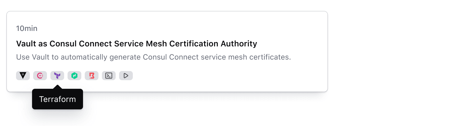
Correct use of a tooltip

Don’t

Avoid using tooltips to place crucial information related to the user’s task.
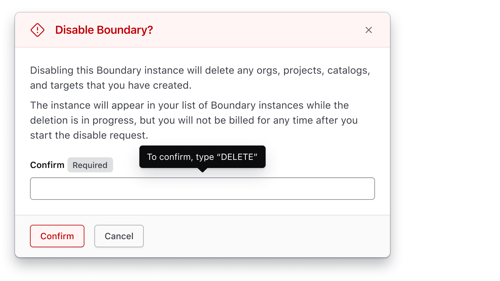
Incorrect use of a tooltip

Placement

Tooltips can be placed in various positions relative to the UI element they are associated with. Choose the placement based on the context and available space around the tooltip trigger.

The most common options are: top, bottom, left, right.

Tooltip with wrapped text

The tooltip supports additional placement options: top-start, top-end, bottom-start, bottom-end, left-start, left-end, right-start, right-end.

How to use this component

The HDS tooltip is provided as both a TooltipButton component and as an hds-tooltip Ember modifier. To be accessible, the element which triggers a tooltip needs to be an interactive element which can receive focus. This means that:

  • if the tooltip needs to be applied to a non-interactive element, the TooltipButton component should be used as it wraps the opener element with a button element.
  • if the tooltip needs to be applied to an element which is already interactive, the hds-tooltip modifier should be used.

Currently, the tooltip uses Tippy.js under the hood for its main functionality.

TooltipButton

As the TooltipButton component wraps its content with an HTML <button> element, there may be possible layout changes when using it to wrap an existing non-interactive element in your application’s UI.

Icon

<Hds::TooltipButton @text="Hello!" aria-label="More information">
  <Hds::Icon @name="info" />
</Hds::TooltipButton>

Inline with text

\n Header text\n \n

<Hds::Text::Display @tag="h4">
  Header text
  <Hds::TooltipButton @text="Hello!" aria-label="More information">
    <Hds::Icon @name="info" />
  </Hds::TooltipButton>
</Hds::Text::Display>

Placement

The tooltip appears at the “top” centered above the opener button content by default. If the tooltip is near any of the edges of the screen, its position will automatically adjust to prevent the tooltip content from being cut off so it remains readable.

Use the @placement argument if you would like to use a different starting position for the tooltip vs. the default.

<Hds::TooltipButton @text="Hello!" @placement="right">
  <Hds::Badge @text="Some tests failed" @icon="alert-triangle" @color="warning" />
</Hds::TooltipButton>

Offset

You can change the offset of the tooltip in relation to the opener element content if needed.

<Hds::TooltipButton @text="Hello!" @offset={{array 50 30}}>
  <Hds::Stepper::Step::Indicator @text="1" @status="incomplete" />
</Hds::TooltipButton>

isInline

You can change the default inline-block display to use flex display if needed.

\n Text before\n \n Text after\n

<p>
  Text before
  <Hds::TooltipButton @text="Hello!" aria-label="HashiCorp" @isInline={{false}}>
    <Hds::Icon @name="hashicorp" />
  </Hds::TooltipButton>
  Text after
</p>

Extra Tippy Options

You can use @extraTippyOptions to provide more specific options to Tippy.js. For a full list of available options refer to the Tippy.js API documentation.

For example, you can use the allowHTML option to enable rich tooltip text:

<Hds::TooltipButton @extraTippyOptions={{hash allowHTML=true}} @text="<b>Hello</b> <em>there</em>!">
  More information
</Hds::TooltipButton>

If you enable the allowHTML option:

  • be sure to sanitize your data
  • to maintain accessibility, do not include interactive content such as links or buttons
  • we recommend using only basic inline-level text formatting tags such as strong or em; using block-level tags such as div or p will make the HTML syntax invalid

Ember modifier

An Ember modifier is available if your use case requires attaching a tooltip to an element that is already interactive (to be accessible, tooltips should only be attached to interactive elements, like buttons, links, inputs, etc).

<Hds::Link::Standalone {{hds-tooltip "Hello!"}} @href="#" @icon="collections" @text="Read tutorial" />

Placement

The page navigation is complete. You may now navigate the page content as you wish.
Skip to main content

The Tooltip component provides additional information to users in a concise and unobtrusive way.

Tooltips are used to provide additional information or context for a UI element, clarify the purpose or function of a UI element, or indicate the meaning of an icon or symbol.

Usage

When to use

When displaying additional context or information that is not critical to the user’s task or decision-making process.

When not to use

  • When the content is too lengthy or complex.
  • When the information provided is critical to the user’s task or decision-making process, consider moving the content to the page or an alert.
Do

Use tooltips to provide additional context or supplementary non-critical information.

Correct use of a tooltip

Don’t

Avoid using tooltips to place crucial information related to the user’s task.

Incorrect use of a tooltip

Placement

Tooltips can be placed in various positions relative to the UI element they are associated with. Choose the placement based on the context and available space around the tooltip trigger.

The most common options are: top, bottom, left, right.

Tooltip with wrapped text

The tooltip supports additional placement options: top-start, top-end, bottom-start, bottom-end, left-start, left-end, right-start, right-end.

How to use this component

The HDS tooltip is provided as both a TooltipButton component and as an hds-tooltip Ember modifier. To be accessible, the element which triggers a tooltip needs to be an interactive element which can receive focus. This means that:

  • if the tooltip needs to be applied to a non-interactive element, the TooltipButton component should be used as it wraps the opener element with a button element.
  • if the tooltip needs to be applied to an element which is already interactive, the hds-tooltip modifier should be used.

Currently, the tooltip uses Tippy.js under the hood for its main functionality.

TooltipButton

As the TooltipButton component wraps its content with an HTML <button> element, there may be possible layout changes when using it to wrap an existing non-interactive element in your application’s UI.

Icon

<Hds::TooltipButton @text="Hello!" aria-label="More information">
  <Hds::Icon @name="info" />
</Hds::TooltipButton>

Inline with text

\n Header text\n \n

<Hds::Text::Display @tag="h4">
  Header text
  <Hds::TooltipButton @text="Hello!" aria-label="More information">
    <Hds::Icon @name="info" />
  </Hds::TooltipButton>
</Hds::Text::Display>

Placement

The tooltip appears at the “top” centered above the opener button content by default. If the tooltip is near any of the edges of the screen, its position will automatically adjust to prevent the tooltip content from being cut off so it remains readable.

Use the @placement argument if you would like to use a different starting position for the tooltip vs. the default.

<Hds::TooltipButton @text="Hello!" @placement="right">
  <Hds::Badge @text="Some tests failed" @icon="alert-triangle" @color="warning" />
</Hds::TooltipButton>

Offset

You can change the offset of the tooltip in relation to the opener element content if needed.

<Hds::TooltipButton @text="Hello!" @offset={{array 50 30}}>
  <Hds::Stepper::Step::Indicator @text="1" @status="incomplete" />
</Hds::TooltipButton>

isInline

You can change the default inline-block display to use flex display if needed.

\n Text before\n \n Text after\n

<p>
  Text before
  <Hds::TooltipButton @text="Hello!" aria-label="HashiCorp" @isInline={{false}}>
    <Hds::Icon @name="hashicorp" />
  </Hds::TooltipButton>
  Text after
</p>

Extra Tippy Options

You can use @extraTippyOptions to provide more specific options to Tippy.js. For a full list of available options refer to the Tippy.js API documentation.

For example, you can use the allowHTML option to enable rich tooltip text:

<Hds::TooltipButton @extraTippyOptions={{hash allowHTML=true}} @text="<b>Hello</b> <em>there</em>!">
  More information
</Hds::TooltipButton>

If you enable the allowHTML option:

  • be sure to sanitize your data
  • to maintain accessibility, do not include interactive content such as links or buttons
  • we recommend using only basic inline-level text formatting tags such as strong or em; using block-level tags such as div or p will make the HTML syntax invalid

Ember modifier

An Ember modifier is available if your use case requires attaching a tooltip to an element that is already interactive (to be accessible, tooltips should only be attached to interactive elements, like buttons, links, inputs, etc).

<Hds::Link::Standalone {{hds-tooltip "Hello!"}} @href="#" @icon="collections" @text="Read tutorial" />

Placement